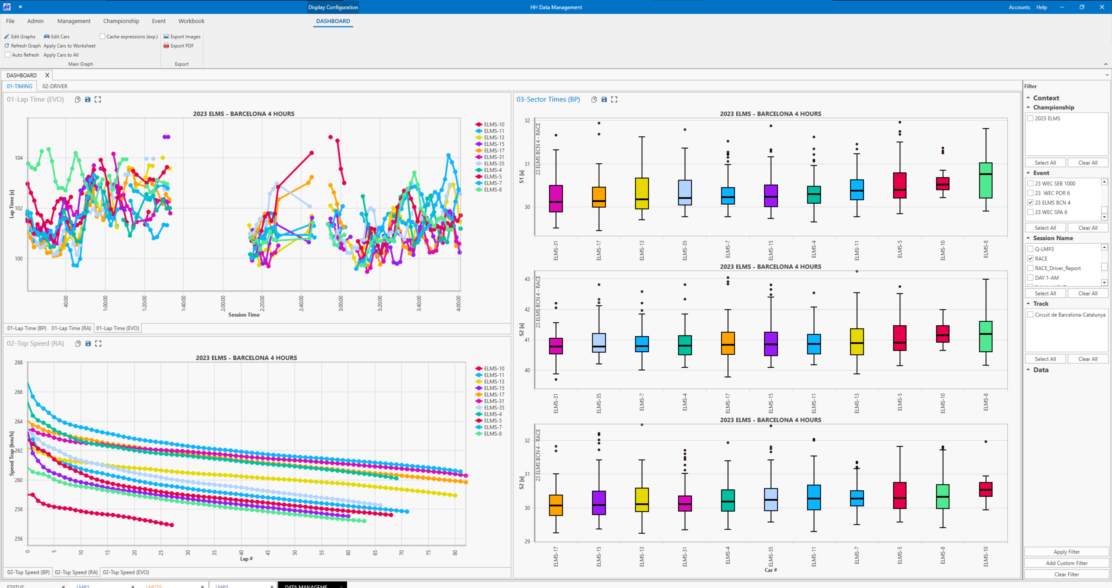
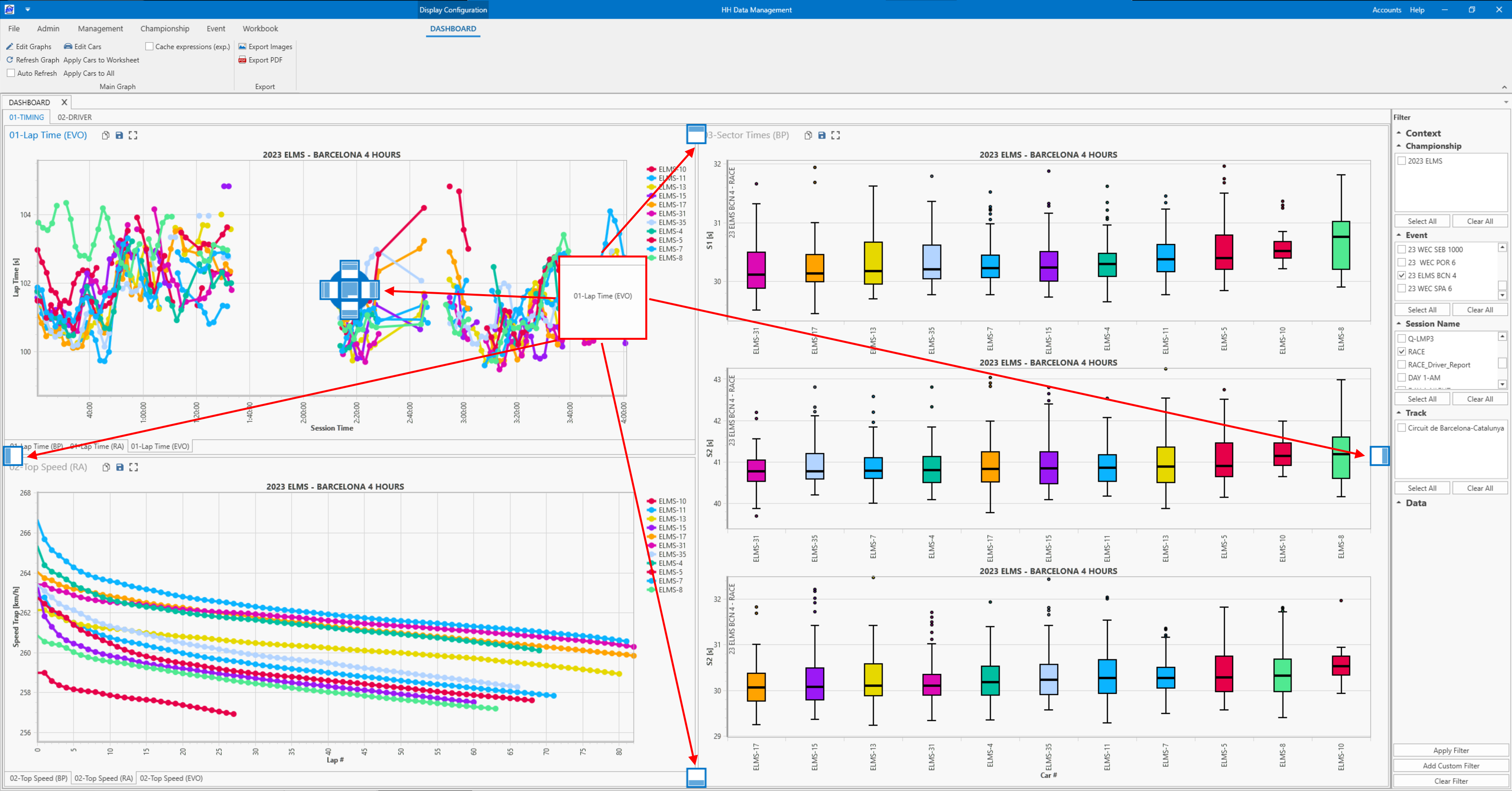
Main Graph
The main graph is designed to be a flexible data visualization tool that lets a variety of data be shown in a variety of different graph types. The supported graph types are:
- line/scatter
- raising average
- box plot
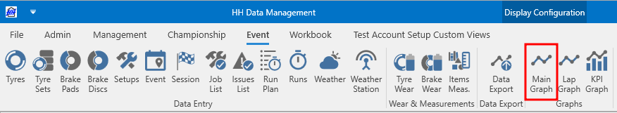
The Main Graph can be accessed from the Event tab of the ribbon bar:
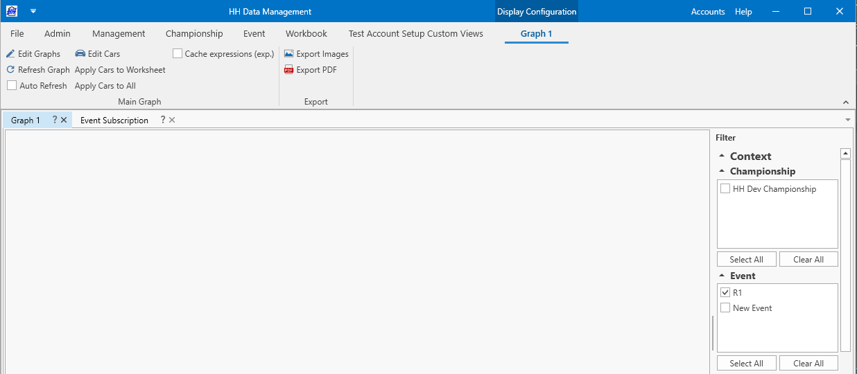
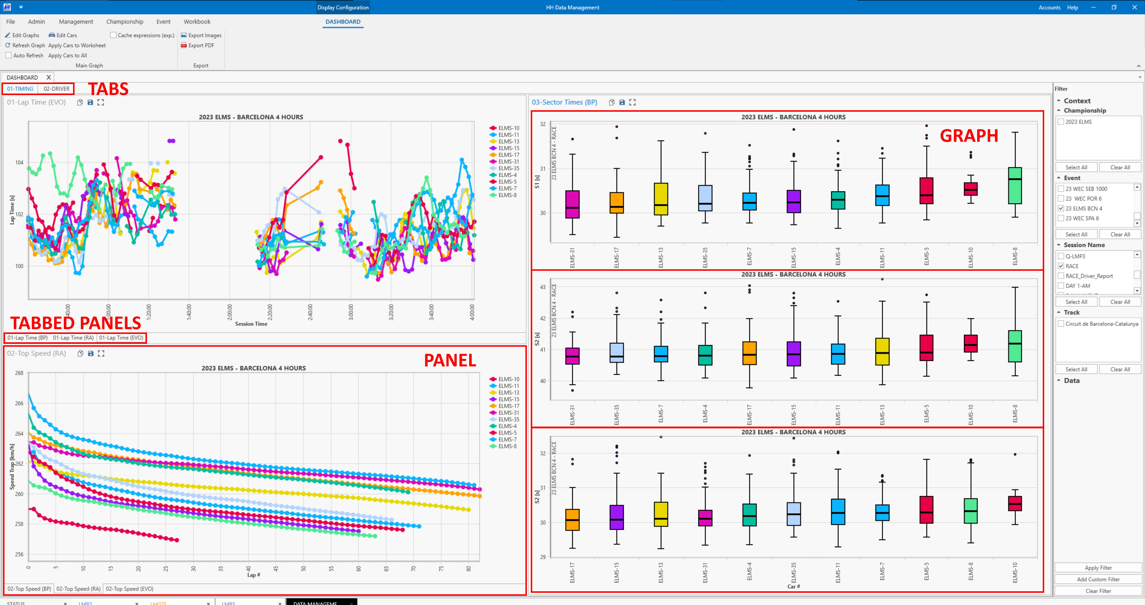
A new tab will appear:
The main graph is configured using the options available from the ribbon bar, and the data to be plotted is selected using the global filter that is shown on the right hand side of the screen.
For a quick walk through of getting started please refer to the main graph tutorial. This shows quickly how to create a lap time graph without giving a full explanation of the concept of the main graph.
Concept
The goal of the main graph is to have the flexibility to create a wide variety of graphs, coming from any of the data sources available in HH Data Management. For example, one might want to create a lap time vs lap number graph based on all laps in an event, or a graph of setup evolution over the whole season, or plot values coming from a part collection (i.e. a damper curve) or an evolution of part measurements. Furthermore, the goal is give flexibility for customizing the graph to determine colour and line style and weight etc.
Scopes and grouping
The general approach for the data configuration in the main graph is to let the user choose what data they want to plot, and then give options to group this data. This overall data selection is called the scope. An example of a scope might be:
Championships.Events.EventCars.EventCarSessions.RunSheets.Laps
This is the scope that would be used to make a plot where each data point is a lap. If the graph should then have a series created for each car, then the individual laps returned by the scope need to be grouped based on the car. This setting is called the series scope, and to accomplish setting a series per car the series scope should be set as:
RunSheet.Car.Number
The series scope is written from the context of the overall scope, so in this example the context of the series scope is on the lap which is why RunSheet is the first segment in the series scope. To reiterate, in this example, the scope is responsible to get all of the laps for all selected events, cars and sessions, and then the series scope is responsible to group these laps by car to create one series per car.
There are different grouping scopes available that allow different types of grouping:
- graph scope: each unique group created by this scope will be shown on a different graph
- x-axis group scope: each unique group created by this scope will be shown on the same graph, but on a different x-axis
- series scope: each unique group created by this scope will be shown in a different series
Car selection
Ribbon functions
The Main Graph view provides the ability to filter which cars will be plotted:

These three buttons in the ribbon bar allow the user to select desired cars and apply the selections to other Main Graphs to reduce repetitive configurations.
| Button | Function |
|---|---|
| Edit Cars | opens the car selection window |
| Apply Cars to Worksheet | sends the selected categories and cars to the other Main Graphs within the worksheet |
| Apply Cars to All | sends the selected categories and cars to all other open Main Graphs |
Car Selection window
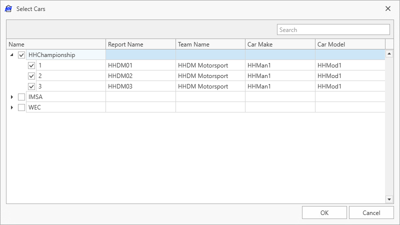
Cars are grouped based on their category and can be selected individually or an entire category can be selected.
Additional filters are described in the Data filtering section.
Graph configuration
Clicking the edit graphs button on the ribbon bar will open the graph configuration window.
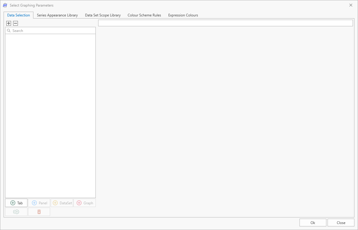
There are five tabs on this window:
- Data Selection
- Series Appearance Library
- Data Set Scope Library
- Colour Scheme Rules
- Expression Colours
The tabs will be explained not based on the order they are shown in the software, but based on the logical order of the information contained on each tab and the importance of the tabs.
Data Set Scope Library
The data set scope library tab contains a collection of all scopes that are used in the graphs. By default it is populated with the three most commonly used scopes:
- runs
- laps
- lap sectors
Any changes on this tab are automatically synced to all the users on an account. Thus, existing items should be modified with care because they have the ability to break the layout of other users.
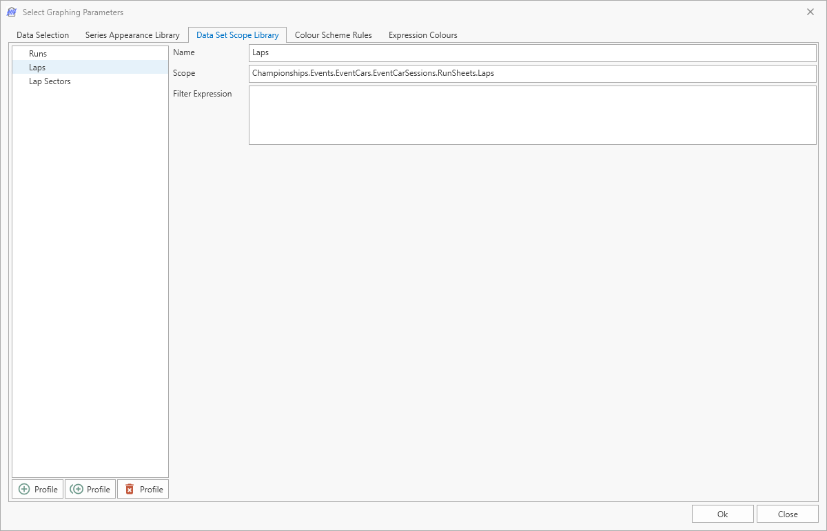
The filter expression can be used to set a filter on the list of items that is returned. It is an alternative option to using the data filter which is applied to all graphs in the window. This could be used for example to have a laps scope that returns all laps and a second one that returns the laps with the in and out laps removed.
Series Appearance Library
The series appearance library is the primary tool that is used to control the appearance of the graph series. As with the data set scope library, the series appearance library is pre-populated with some of the most common options. There is a set of options for the series appearance depending on the graph type (line graph or box plot).
Additionally, any changes on this tab are automatically synced to all the users on an account. Thus, as with the data set scope library, existing items should be modified with care because they have the ability to break the layout of other users.
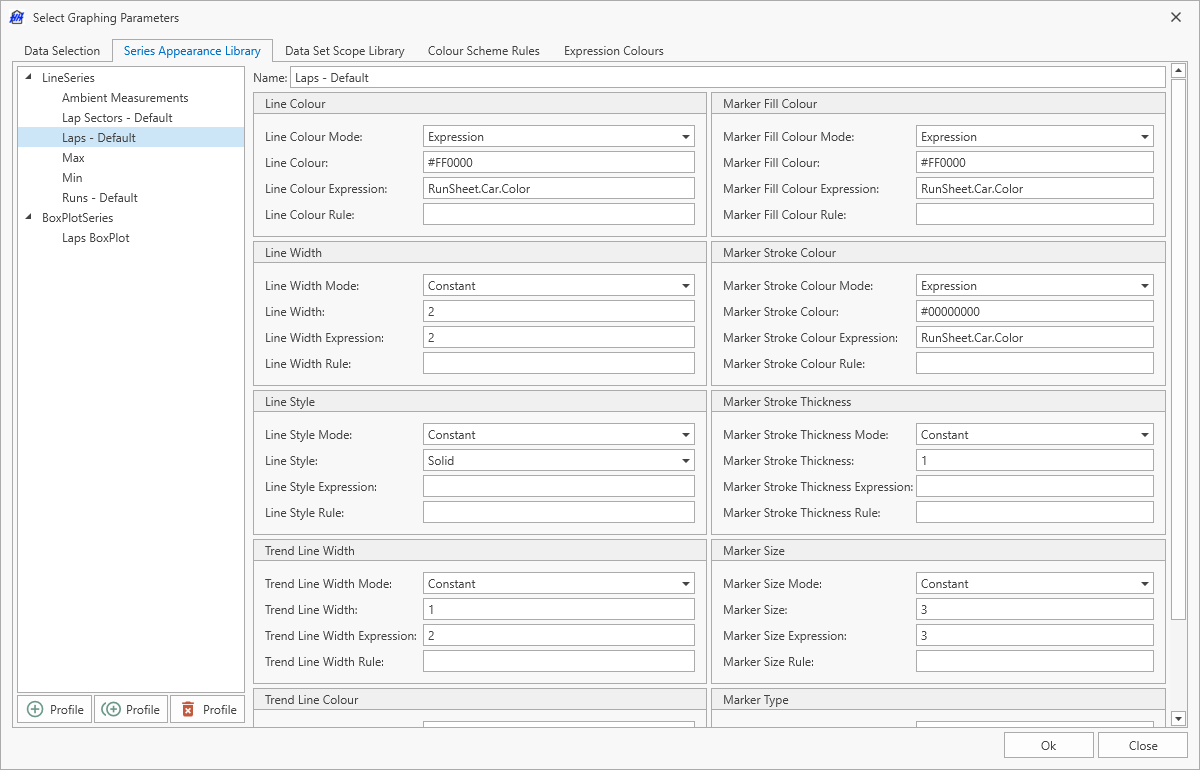
For a line graph the following properties can be customized:
- line colour
- line width
- line style
- trend line colour
- trend line width
- marker fill colour
- marker stroke colour
- marker stroke thickness
- marker size
- marker type
For a box plot the following properties can be customized:
- line colour
- line width
- line style
- trend line colour
- trend line width
- box fill colour
- box width
- median line width
- median line colour
- median line style
Ultimately, regardless of the type of the property the options available are all the same. Using the line colour as an example:

There are four different modes:
- Constant
- Expression
- Rule
- Based on expression
Constant
In constant mode a constant value can be defined. In this example a constant colour of #FF0000 which is the hex value for red. If this profile were applied then it would mean that every line series on the graph would be red, regardless of what lap, session etc. the series was representing.
Expression
In expression mode an expression can be written that will be evaluated one for each series. In this example (which is from the Laps - Default profile) the expression is RunSheet.Car.Color and if this was applied to a series coming from the lap scope then the colour of each series would be the colour defined for the car.
Rule
In this case the appearance will be determined by a colour scheme rule. The path to get to the entity to use for the rule matching should be supplied. For example if there is a rule applied to the cars, and using this example which is the Laps - Default profile, then the expression for the rule should be RunSheet.Car. This will return the car to be matched against the supplied rules.
Based on expression
In this case the appearance will be determined by an expression colour.
Data Selection
The data selection tab is where the graph is constructed, and the items from the data set scope and series appearance libraries are used. There are three levels to manage when building a graph:
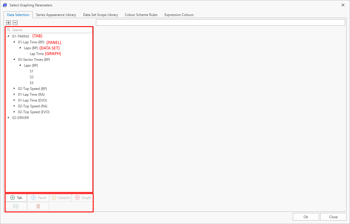
The data selection items can be re-ordered by drag and drop within their respective parent elements.
Tab
Tabs are purely for organizational purposes and don't have any options to customize the data. The only option to set on a tab is the name. This is the name that will be shown on the tab in the software.
Panel
Panels are purely for organizational purposes and don't have any options to customize the data. The only option to set on a panel is the name. This is the name that will be shown on the panel in the software. Panels can be dragged around and tabbed together to customize the layout.
Data Set
Data sets are where most of the graph configuration is done. This is where the scopes of all levels and the appearance profile are selected.
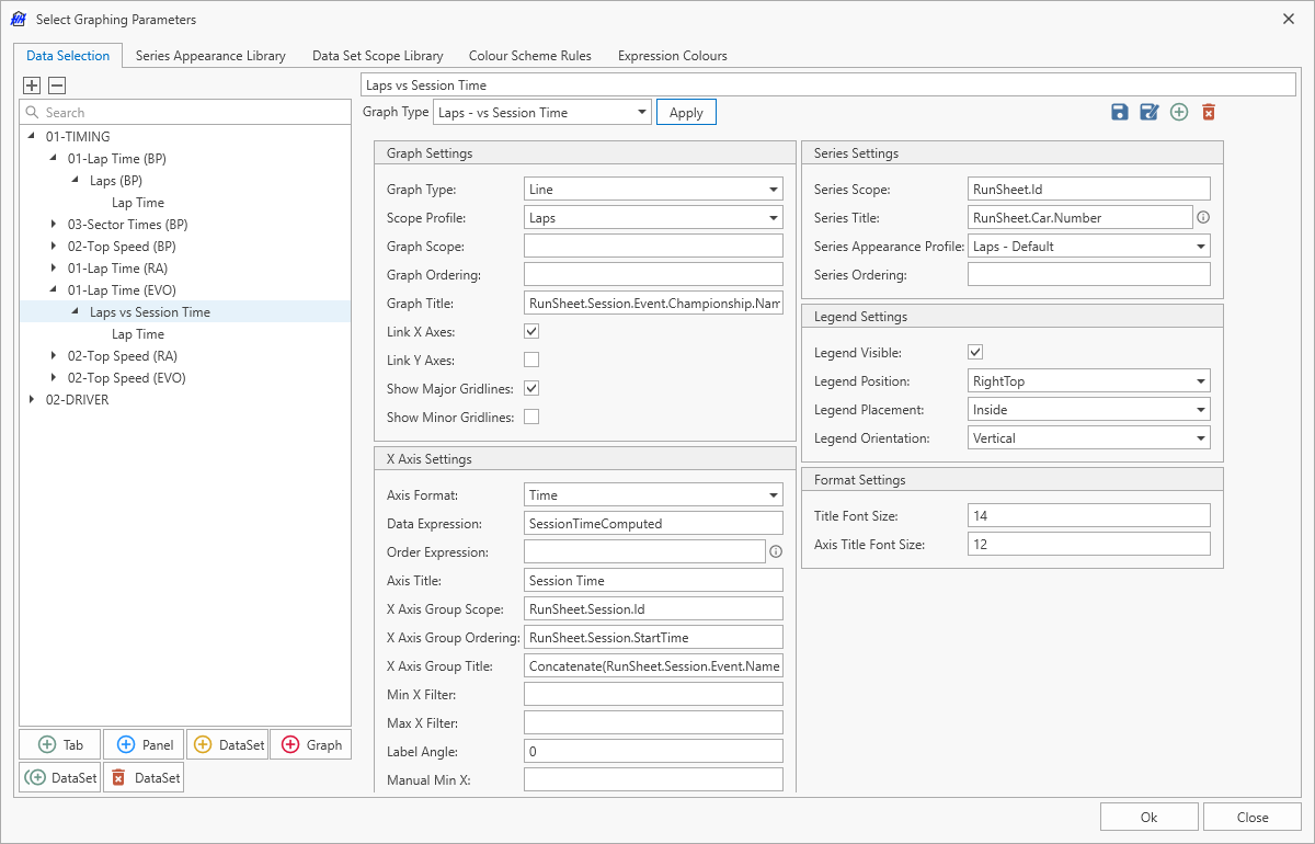
The options available in the data set settings will vary depending on the type of graph selected.
In most cases only one data set is required. Multiple data sets can be added to a graph if different data set scopes are to be shown on the same graph. For example, a second data set could be used to show the air temperature (coming from the ambient measurements) on a Lap Time vs Time Of Day graph.
The behaviour of additional data sets is currently subject to some limitations. For the graph to display correctly, an x-axis grouping expression cannot be supplied for any data sets when there is more than one data set. Furthermore some options that are set on the additional data sets will not be applied to the graph. For example, the axis titles defined in the graph level are always taken from the primary data set.
Graph type templates
The graph type combobox at the top of the panel settings provides templates for the most common graph types. Select the desired graph type and press Apply. The panel settings will be populated with the correct information.
These templates can be modified or added to with the buttons on the right:
| Icon | Description |
|---|---|
 | Saves the current graph settings to the selected graph template, and syncs to all users. It does nothing if no template is selected. |
 | Saves the current graph settings to a new graph template that any user on the account can then use. |
 | Clears all the current graph settings and creates a new graph template from scratch. |
 | Deletes the currently selected graph template. This deletes the template for all users so should be done with care. It does nothing if no template is selected. |
Graph settings
- Graph Type: defines the type of graphs that will be within the Panel: Line, Raising average, or BoxPlot
- Scope Profile: this allows the scope for the graph to be selected based on the data set scope library
- Graph Scope: defines the scope of the graph as explained in the concept section. This value is optional and if left blank all series will be shown on the same graph. If a graph scope is defined that results in multiple graphs being created the graphs will be tiled horizontally.
- Graph Title: defines the title shown above each graph
- Link X Axes: links the X axes of all graphs within the panel (for zooming and panning)
- Link Y Axes: links the Y axes of all graphs within the panel (for zooming and panning)
- Show Major Gridlines
- Show Minor Gridlines
A scatter plot can be defined by selecting 'Line' and hiding the lines between points through an appearance profile.
Raising average settings
- Raising Average Reversed: flips the raising average to be a decreasing average (e.g. if you are plotting top speed)
- Calculate Average: defines whether to plot the averaged data or the raw data (e.g. when disabled, raw data is plotted from smallest to largest or largest to smallest depending on the Raising Average Reversed setting)
X axis settings
- Axis Format: Normal, Time, or Time Of Day
- Data Expression: the expression that defines what is shown on the x-axis of the graph
- Order Expression: the expression that defines what order the values returned by the Data Expression are shown in (within groupings on the x-axis). This only applies if Data Expression returns a string. If Data Expression returns a sortable value (i.e. a number or a date/time), this expression is not used.
- Axis Title: title of the x-axis
- X Axis Group Scope: defines the scope of the x-axis groups as explained in the concept section. This value is optional and if left blank, no groups are on the x-axis.
- X Axis Group Ordering: defines the order the groups are drawn on the graph (left to right)
- X Axis Group Title: defines the grouping title shown at the border between groups on the x-axis
- Min X Filter: the minimum allowed value for the x-axis points based on the value returned by the data expression
- Max X Filter: the maximum allowed value for the x-axis points based on the value returned by the data expression
- Label Angle: define the angle for the X axis label in degrees, by default it displays with a 0 degree angle
- Manual Min X: allows the minimum value for the x-axis to be manually defined. If left blank, the axis minimum is determined by the data extent
- Manual Max X: allows the maximum value for the x-axis to be manually defined. If left blank, the axis maximum is determined by the data extent
Series settings
- Series Scope: defines the scope of the series as explained in the concept section. This value is optional and if left blank all data is shown in the same series.
- Series Title: defines the title displayed in the legend. The value entered is evaluated as an expression. If ##ParameterName## is included in the expression, it is replaced with the name of the parameter used to build the series.
- Series Appearance Profile: defines the profile to use from the series appearance library to use for styling graphs in this panel.
- Series Ordering: defines the property that is used to set the order of the series.
Legend settings
- Legend Visible: controls whether the legend is shown
- Legend Position: controls the position of the legend
- Legend Placement: controls if the legend is shown inside or outside the graph
- Legend Orientation: controls whether legend items are drawn vertically or horizontally. It is reverted to
Verticalif the legend is positioned left or right of the plot.
Format settings
- Title Font Size
- Axis Title Font Size
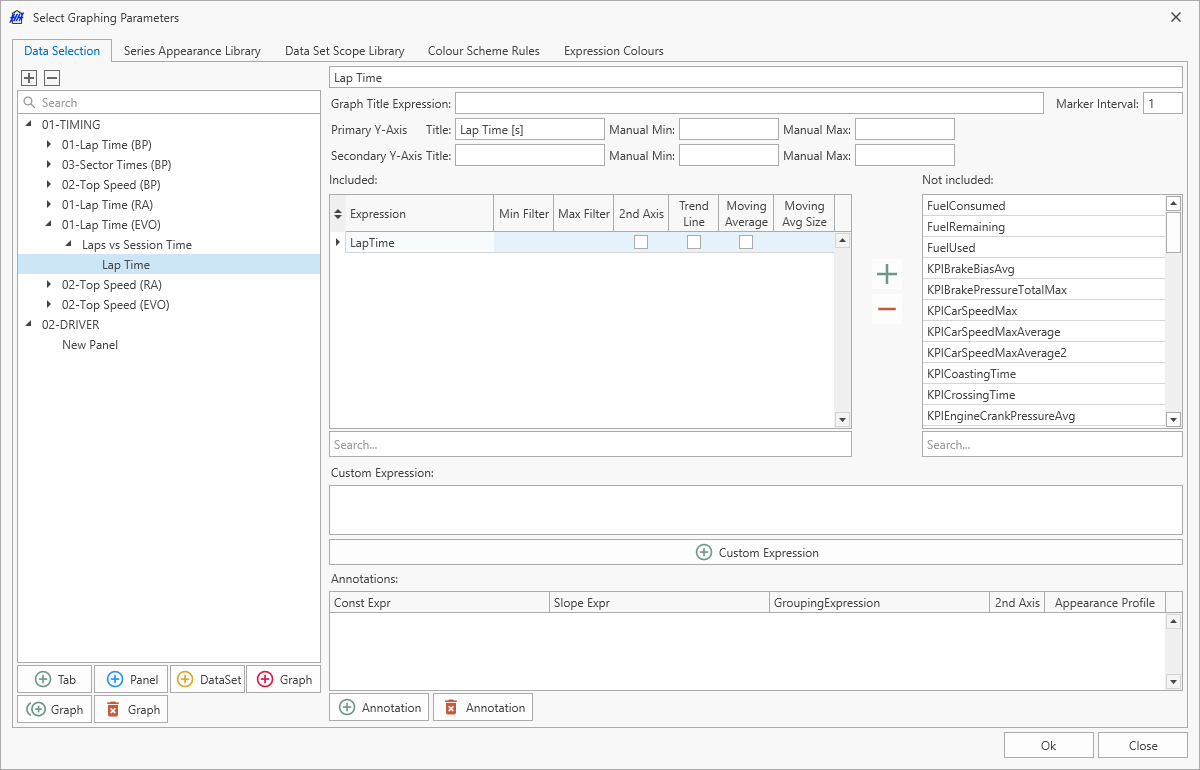
Graph
The graphs is where the y-axis data for graph is selected as well as some configuration of the y-axes. There is also the possibility to define annotations in this section. If multiple graphs are added to a panel, then the graphs will be tiled vertically.
Configuration
For both the primary and secondary y-axes the title can be set and the minimum and maximum of the axes can be manually defined. If this is not defined then the minimum and maximum will be determined by the data extent.
- Graph Title Expression: an optional property, if set overrides the graph title defined by the Panel.
- Marker Interval: defines the frequency at which markers are drawn. Must be a positive non-zero integer. By default it is set to
1, meaning every data point is drawn. If it is set to5, for example, a marker is drawn for every fifth point in the data according to the series appearance profile. This does not affect the lines drawn between data points.
Data
There are two ways to select the data for the y-axis. The simplest is to select from the list of parameters in the list titled Not included. Double clicking on a parameter name will add it to the Included list. Or the + and - icons can be used. Alternatively, a custom expression can be written if its not possible to access the data directly from a parameter.
For each parameter or expression that is added to the graph there are some options. The options differ depending on the type of graph that is currently being edited.
- Min Filter: manually define the minimum value for this expression
- Max Filter: manually define the maximum value for this expression
- 2nd Axis: controls if this data will be shown on the secondary y-axis on the right
- Trend Line: controls whether a trend line will be shown for this data. The trend line appearance is controlled using the selected series appearance profile for the current panel.
- Moving Average: allows the data to be shown as a moving average. When enabled, the original data will be replaced by the calculated moving average of each original point.
- Moving Avg Size: defines the number of points to use for the moving average. This value is ignored when the Moving Average option is not enabled.
The order the series are drawn on the graph is controlled by the order of the parameters in this window. This can be adjusted by dragging and dropping the parameters to change their order.
Annotations
Annotations can also be defined in this section. The two important settings are the Const Expr and Slope Expr. If only the Const Expr is defined then the annotation will be a horizontal line, however the Slope Expr can also be defined to have a non-horizontal annotation. These values can be constant or they can be math expressions to create annotations that depend on values entered in the software.
The following settings are also available in addition:
- Grouping Expression:: this allows an expression to be defined that will create multiple annotations. For example if the scope of the graph is lap, then this grouping expression could be written as
RunSheet.Car.Numberand in this case all cars shown on the graph would have their own annotations drawn. If this value is left blank then only a single annotation would be drawn on the graph for each row in the Annotations table. - 2nd Axis: controls if the annotation will be shown on the secondary y-axis on the right
- Appearance Profile: allows a series appearance profile from the series appearance library to be selected. By default the series appearance library contains two profiles called Min and Max that are intended to be used for annotations. Min will draw a blue line, and Max will draw a red line.
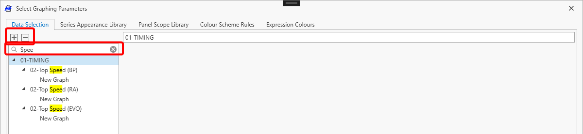
Graph Tree
The data selection graph tree can be searched by using the search bar on top of the tree. There is also a way to expand all nodes in the tree with the  -button or to collapse all nodes with the
  -button.
Colour Scheme Rules
The colour scheme rules tab gives an alternative approach to setting some of the appearance properties of series. In principle it doesn't add any new functionality, as any styling items could be added as parameters on the entity definitions, but it does provide a quicker way to set up some display options.
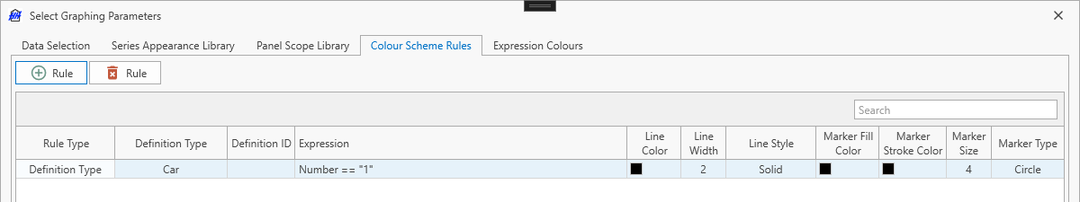
The type of the rule can be either definition type or definition ID. If it is definition type then the rule will be applied to all entities with the definition type selected in the definition type column. If the rule is definition ID then the rule will be applied to all entities linked to the definition ID specified in the definition ID column. The expression allows further filtering to determine which entities the rule will be applied to.
In this example, the rule will be matched to any cars for which the expression Number == "1" evaluates to true.
Expression Colours
The expression colours tab allows a series to be styled based on the actual string of the expression that generated the data, rather than the data itself.
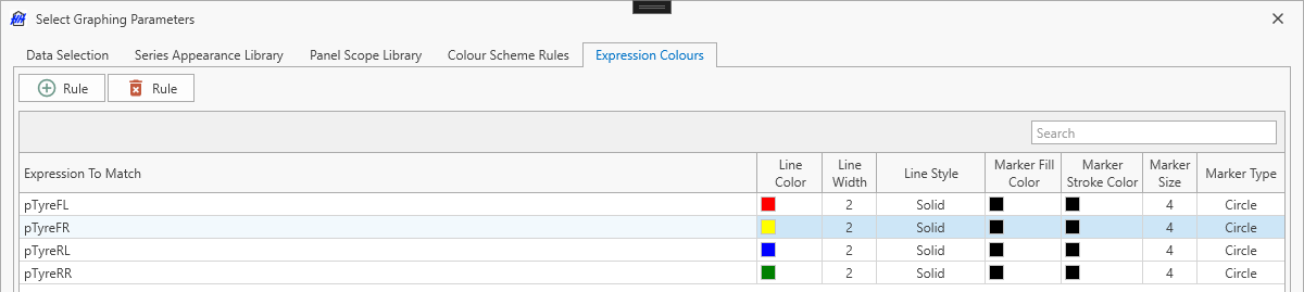
The screenshot gives an example of how this feature could be used. Consider trying to make graph showing a tyre pressure KPI, with one series for each tyre pressure. Without this feature it wouldn't be possible with a series appearance profile to differentiate between these series. Using four expression colour rules, each series could be a different colour based on the name of the lap parameter where the tyre pressure is stored.
Data filtering
The Global Filter control is shown on the right hand side of the main graph. It is used to select which events and sessions should be shown in the graph. Please refer to the Global Filter documentation for an explanation on how to use this control.
As noted in the filter documentation, this control has the ability to sync the current filter with all other Main Graphs within the current worksheet and/or all Main Graphs in the opened layout.
Working with the graphs
After the graph is configured and data is showing panels can be resized and moved by dragging the edge of the window, in the same way that views can be dragged in HH Data Management.
There are buttons beside the title of each panel:
| Icon | Description |
|---|---|
 | Copies an image of the current panel to the clipboard |
 | Opens a save file dialog to save an image of the current panel to the users computer |
 | Maximizes the current panel |
Additional options
Refreshing the graph
By default the main graph does not refresh automatically. Clicking the refresh graph button will trigger a manual refresh of the graph. Selecting the auto refresh button will enable an automatic periodic refresh of the graph (once per minute).
When working with a large amounts of data or lots of graphs, it is recommended to not select the 'Auto Refresh' option as it can cause the overall performance of the software to suffer.
Cache expressions
To improve the performance of the main graph, expression processing can make use of caching. This is an experimental feature and it's disabled by default.
Exporting images

Clicking export images will open a popup window that allows the image size and an output directory to be defined. All graphs will then be exported as images to the output directory. The file name of each exported graph will be based on the name of the tab, panel and graph defined in the graphing configuration.
Exporting to PDF

Clicking export PDF will open a popup window that allows the image size and an output file to be defined. All graphs will then be exported to a single PDF with one graph on each page.