CGD Definition
The custom grid display (CGD) is a type of display that allows users to design their own view. The CGD can consist of a single Cell or it can consist of multiple Layout Items and Cells and it can also contain nested CGDs, thus making it a powerful tool to customize views in HH DM.
The structure and appearance of the CGD can be configured using the CGD definition editor.
There are limitations in the conflict resolution when editing the CGD definition. Therefore, if two users are making changes at the same time, work can get overwritten for one of the users depending on the order that they press save. Therefore it is recommended that only one person is editing a definition at a time.
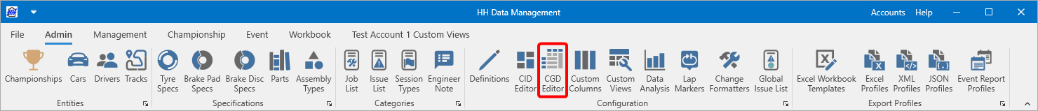
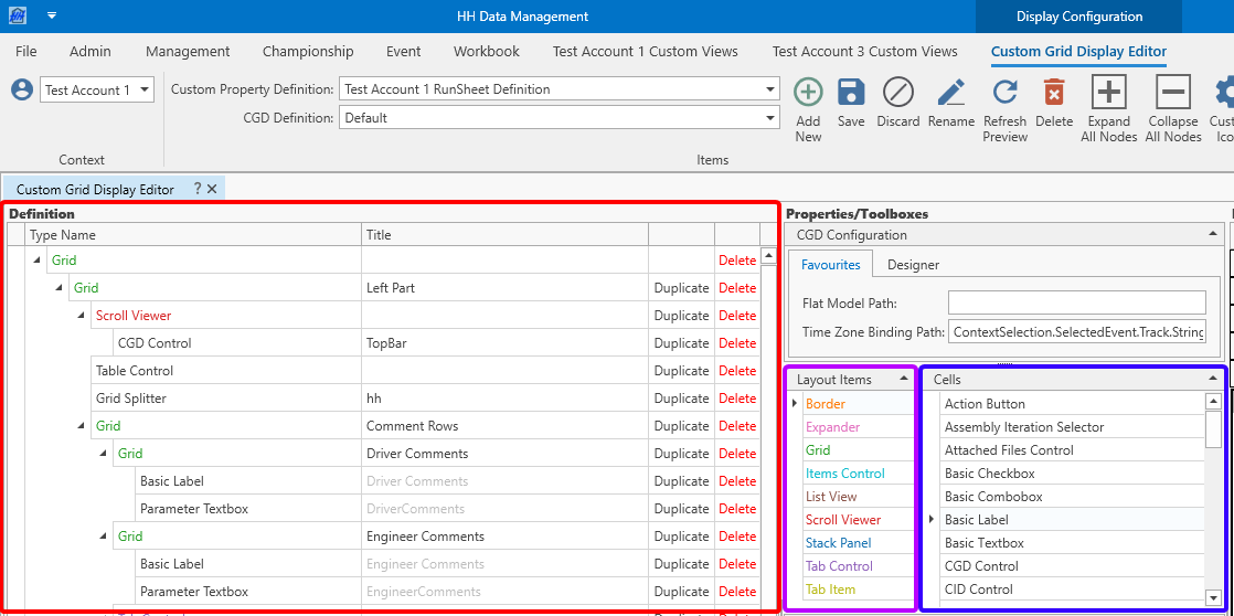
The CGD definition editor can be accessed from the Admin Ribbon Bar
Each CGD definition is linked to a definition. The first thing to do when creating or editing a CGD definition is to select the definition from the combobox on the ribbon bar:
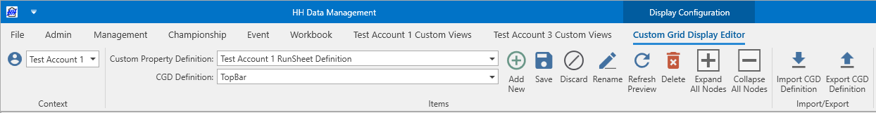
A definition can have multiple CGD definitions. CGD definitions will be mostly used in Custom Views, but can also be used to customize the Run View. To customize the Run View the CGD needs to get set in the Backstage Options.
Once a custom property definition and CGD definition are selected the CGD designer view will be populated.
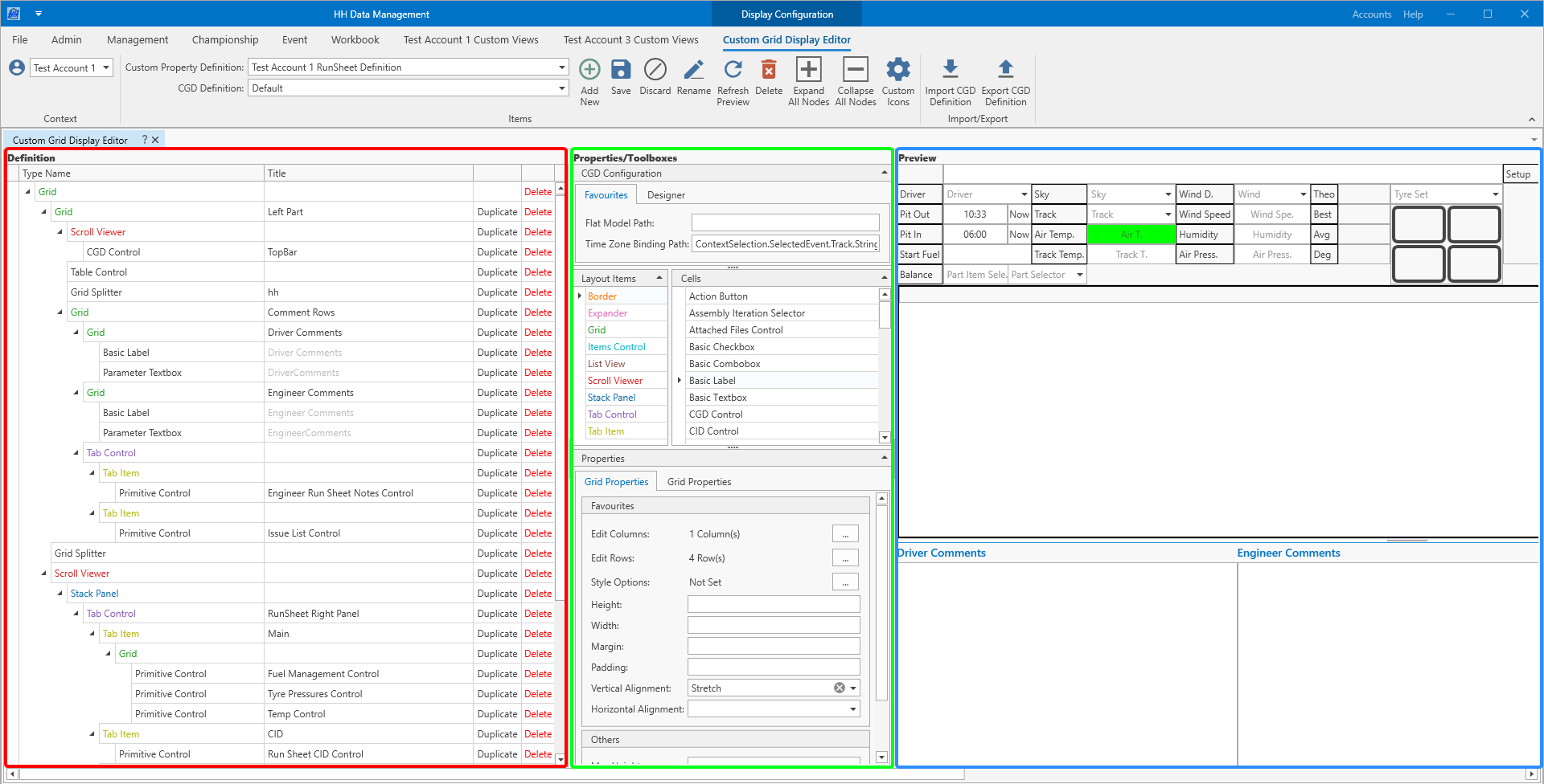
There are three areas on the screen:
- on the left is the designer area where the structure of the definition is actually edited
- in the center there is the properties/toolboxes area where items can be dragged from to the designer area to add to the designer, and also some areas to edit the configuration data for each element
- on the right is the preview area where an example of the current definition is shown
Unlike other parts of the software the user must click Save after making changes to the CGD to commit them to the database. This is done to make it easier to experiment without impacting other users. When Save is clicked and the changes are committed to the database the following things will happen:
- the preview will be updated
- any views that are open that use the current CGD definition will be updated with the latest changes
- the changes will be sent to the server and broadcast to all other users on the account, who will also have their open views updated with the latest changes
While experimenting with the designer it's sufficient to press the Refresh Preview button, which just refreshes the the preview without saving the changes into the database. Like this it can be avoided to update for example the setup CGD that is used in the Setups View, which other users might be working with. But in this case the users needs to remember to save the CGD once the design is done, otherwise the changes will be lost.
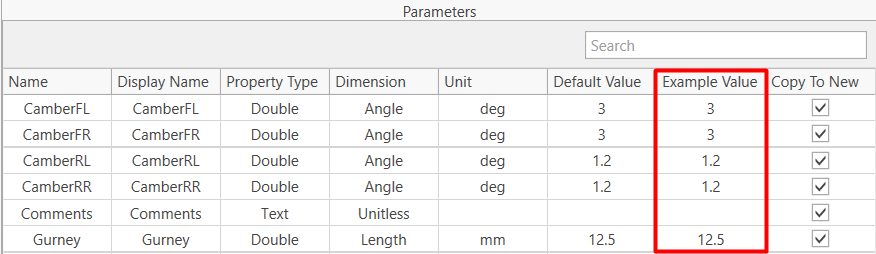
The values shown in the CGD in the preview area are populated based on the values in the Example Value of the definition parameters
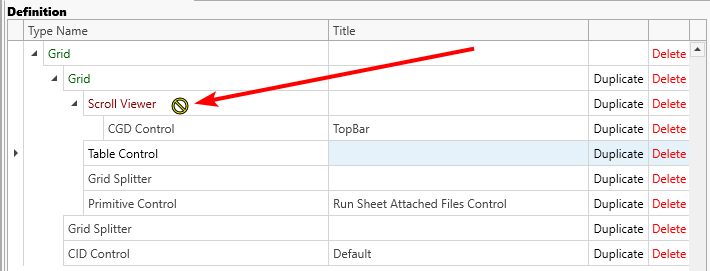
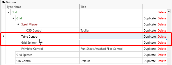
Elements can be created primarily by dragging from the Layout Items or Cells toolbox area and dropping on to the designer area:
Elements can only be added to valid parents. The cursor gives feedback to the user while dragging, if the dragged item and the target item are compatible.
Not compatible:
Compatible and the dragged element would be inserted between the Table Control above and the Grid Splitter below the cursor:
Elements can be reordered by dragging them to a different location in the designer.
Holding the control key while you drag an existing element will create a copy of the element in the new location rather than moving the original element
The elements within the CGD are distinguished in two groups:
- Layout Items: A layout item doesn't display or visualize data itself, its only purpose is to arrange Cells within itself. Layout Items can be nested to create multiple layers. A layout item always needs to have one or more children. Some layout items support only one child and some support multiple children.
- Cells: A cell is the control that is used to display data and depending on the cell type, also to edit the data. Depending on the data type that should be displayed there are numerous cells available.
Layout Items
Many layout items require setting one or more paths. Those paths will be explained more in detail in the respective section, but there is also a common section about Expression Binding.
Border
A border is a layout item that supports a single child element and is used to visually separate or highlight content by drawing a border around it. The border can be customized in terms of thickness, color, and corner radius. This is useful for grouping related controls or emphasizing specific areas within a layout.
Favourites:
- Border Thickness: Sets the thickness of the border on each side. The thickness can be set using four values representing the thickness on the left, top, right, and bottom. If only one value is entered the value will apply to all four edges. If only two values are entered the first value will apply to the left and right edges and the seconds value will apply to the top and bottom edges.
- Corner Radius: Sets the radius for the border's corners, allowing for rounded edges.
- Style Options - Supported options: Background Colour/Foreground Colour. For further info see Style Settings.
Others:
Expander
An expander is a layout item that can show or hide its content. It is typically used to save space in the user interface by allowing users to expand or collapse sections as needed. The expander consists of a header and a content area that can contain other layout items or cells.
Favourites:
- Header: The text displayed in the header of the expander.
- Header Binding Path: Allows the header text to be dynamically set by binding to a value.
- Icon Name: Name of the icon displayed next to the header text.
- Icon Type: Defines the source of the icons. Custom icons can be managed by clicking the Custom Icons button in the ribbon.
- Style Options: Supported options: Background Colour/Foreground Colour. For further info see Style Settings.
Others:
- Control Properties
- Framework Element Properties
- String Format - Defines the format of the displayed text. For further info see Formatting Types.
Grid
A grid layout supports multiple children. The children are arranged through columns and rows in a tabular way. When using a grid layout the amount of columns and rows needs to get set through the respective buttons. Additionally every child element needs to get assigned to a column and a row through the Grid Properties settings. See also Grid Unit Type.
When using Auto or Pixel as Grid Unit Type the user needs to ensure that the grid layout is large enough to display all the child elements. Maybe it requires wrapping the grid layout item into a Scroll Viewer.
Favourites:
- Edit Columns: Opens a popup window that allows the user to define the amount and width of columns.
- Edit Rows: Opens a popup window that allows the user to define the amount and height of rows.
- Style Options: Supported options: Background Colour. For further info see Style Settings.
Others:
Items Control
ItemsControl is a component used to display a list of items. It allows you to define how each item should look and how they should be arranged. The main purpose of this control is to define a path to a collection of items and a template and then it visualizes each item with a copy of the template.
Favourites:
- Items Source Path: Defines the path to a collection of items.
- Orientation: For further info see Orientation.
Others:
List View
A List View is a control used to display a list of items, allowing users to select an item from the list. It is commonly used for presenting collections where selection is important.
Favourites:
- Items Source Path: Source of the list that is displayed in the control. (Example: [FlatModel].ContextSelection.SelectedEvent.Sessions).
- Selected Value Binding Path: Path to the selected value in the bound data source.
- Alias: For internal use only.
Others:
Scroll Viewer
A scroll viewer supports only one child. Depending on the size of the child and the following settings, a scroll viewer displays a horizontal and/or vertical scrollbar around the child control.
Favourites:
- Horizontal Scroll Bar Visibility: Controls the visibility of the horizontal scrollbar. For further info see Scroll Bar Visibility.
- Vertical Scroll Bar Visibility: Controls the visibility of the vertical scrollbar. For further info see Scroll Bar Visibility.
- Style Options: Supported options: Background Colour. For further info see Style Settings.
Others:
Stack Panel
A stack layout supports multiple children. It arranges its children according to the Orientation. A stack layout items is often a child of a Scroll Viewer. If the size of the children exceeds to the size of the stack layout item, parts of the children are not visible, that is why the combination of a Scroll Viewer and a stack layout item is common.
Favourites:
- Orientation: For further info see Orientation.
- Style Options: Supported options: Background Colour. For further info see Style Settings.
Others:
Tab Control
A tab control supports multiple children of type Tab Item. It represents a control that contains one or multiple items that share the same space on the screen.
Favourites:
- Style Options: Supported options: Background Colour/Foreground Colour. For further info see Style Settings.
Others:
- Selected Tab Binding Path: Path to the selected Tab Item in the bound data source..
- Control Properties
- Framework Element Properties
Tab Item
A tab item supports one child. It must be the child of a Tab Control and it represents a selectable item inside a Tab Control.
Favourites:
- Icon Name: Name of the icon displayed next to the title.
- Icon Type: Defines the source of the icons. Custom icons can be managed by clicking the Custom Icons button in the ribbon.
- Is Title Format: Sets some predefined values for Alignment, Foreground and Font that are used across the software.
- String Format - Defines the format of the displayed text. For further info see Formatting Types.
- Title: The text displayed in the header of the tab item.
- Title Binding Path: Allows the header text to be dynamically set by binding to a value.
Others:
- Style Options: Supported options: Foreground Colour/Font Weight/Font Style/Font Size. For further info see Style Settings.
- Control Properties
- Framework Element Properties
Cells
In many cells it's required to define one or more paths. For some of those paths it's required to access the underlying flat model. To do that the path needs to start with [FlatModel].
Example:
In the following example a Basic Combobox is defined in a CGD linked to the RunSheet definition. The goal of the example is to display a dropdown of all drivers of a certain car in an event and store that information in the property called Driver of the RunSheetFlatModel:
| Parameter | Value |
|---|---|
| Items Source Binding Path | ContextSelection.SelectedEventCarEntryListModel.DriversInCar |
| Selected Value Binding Path | [FlatModel].Driver |

Input Cells
Assembly Iteration Selector
Allows selection of an assembly iteration and binds to an assembly custom property.
Favourites:
- Linked Assembly - The Assembly Parameter to bind to.
- Display Parameter - Defines which parameter of the linked entity is shown in the display. If not defined, it defaults to 'DisplayName'.
- Ass. Iter. Sel. Filter Mode - Assembly Iter. Selector Filter Mode - works in conjunction with the Named Assembly Filter
- Named Assembly Filter - When enabled only Assembly Iterations of the same Named Assembly than the selected Assembly Iteration are shown in the dropdown. Otherwise all Assembly Iterations of the same Assembly Type are shown.
Others:
- Name For Permissions - Specifies the name used for the permissions.
- Null Text - Text displayed when no item is selected/no text is entered.
- Style Options - Supported options: Background Colour/Foreground Colour/Font Weight/Font Style/Font Size/Read Only. For further info see Style Settings.
- Control Properties
- Framework Element Properties
Basic Checkbox
An editable checkbox control that can be defined completely free.
Favourites:
- Value Binding Path - Path to the value in the bound data source.
Others:
- Name For Permissions - Specifies the name used for the permissions.
- Show Tooltip - Defines if a tooltip should be shown or not when hovering over the item with the mouse cursor.
- Style Options - Supported options: Background Colour/Foreground Colour/Font Weight/Font Style/Font Size/Read Only. For further info see Style Settings.
- Tooltip Binding Path - Allows to define the tooltip text dynamically by binding it to a value. The binding path needs to get defined relative to the underlying flat model. If Tooltip and Tooltip Binding Path are defined at the same time, Tooltip Binding Path wins.
- Tooltip Text - The text that is display within the tooltip. If TooltipText and Tooltip Binding Path are defined at the same time, Tooltip Binding Path wins.
- Control Properties
- Framework Element Properties
Basic Combobox
Allows a user to select an option from a list that can be defined by the settings below.
Favourites:
- Items Source Binding Path - Source of the list that is displayed in the combobox. (Example: [FlatModel].ContextSelection.SelectedEvent.Sessions).
- Selected Value Binding Path - Path to the selected value in the bound data source.
- Display Member - Gets or sets a field name in the bound data source whose values are displayed by the editor.
- Value Member - Gets or sets a field name in the bound data source, whose values are assigned to item values.
Others:
- Is Text Editable - Determines if the text in the combobox can be edited by the user.
- Name For Permissions - Specifies the name used for the permissions.
- Null Text - Text displayed when no item is selected/no text is entered.
- Style Options - Supported options: Background Colour/Foreground Colour/Font Weight/Font Style/Font Size/Read Only. For further info see Style Settings.
- Control Properties
- Framework Element Properties
Basic Textbox
An editable text control that can be defined completely free.
Favourites:
- Text Binding Path - Path to the text value in the bound data source.
Others:
- Accepts Return - Gets or sets a value that indicates how the text editing control responds when the user presses the ENTER key. If true, pressing the ENTER key inserts a new line at the current cursor position; otherwise, the ENTER key is ignored.
- Name For Permissions - Specifies the name used for the permissions.
- Null Text - Text displayed when no item is selected/no text is entered.
- Output Format Options - Defines the format in which the text is displayed. For further info see Format Options.
- Show Tooltip - Defines if a tooltip should be shown or not when hovering over the item with the mouse cursor.
- Style Options - Supported options: Background Colour/Foreground Colour/Font Weight/Font Style/Font Size/Read Only. For further info see Style Settings.
- Text Wrapping - Determines how text is wrapped in the textbox. For further info see Text Wrapping.
- Tooltip Binding Path - Allows to define the tooltip text dynamically by binding it to a value. The binding path needs to get defined relative to the underlying flat model. If Tooltip and Tooltip Binding Path are defined at the same time, Tooltip Binding Path wins.
- Tooltip Text - The text that is display within the tooltip. If TooltipText and Tooltip Binding Path are defined at the same time, Tooltip Binding Path wins.
- Vertical Scroll Bar Visibility - Controls the visibility of the vertical scrollbar. It only applies with Text Wrapping enabled. For further info see Scroll Bar Visibility.
- Control Properties
- Framework Element Properties
Conditional Calculated Textbox
Binds to a property defined in a plugin's flat model (Linked Calculated Parameter) and a double property (Linked Manual Entry Parameter) . If the Manual Entry Parameter has a null value, the Calculated Parameter is shown.
Favourites:
- Linked Calculated Parameter - The calculated parameter to bind to, which is usually defined in a flat model through the plugin.
- Linked Manual Entry Parameter - The manual entry Parameter to bind to, which is stored in the database. Only Parameters of type double are allowed.
Others:
- Name For Permissions - Specifies the name used for the permissions.
- Null Text - Text displayed when no item is selected/no text is entered.
- Output Format Options - Defines the format in which the text is displayed. For further info see Format Options.
- Show Tooltip - Defines if a tooltip should be shown or not when hovering over the item with the mouse cursor.
- Style Options - Supported options: Background Colour/Foreground Colour/Font Weight/Font Style/Font Size/Read Only. For further info see Style Settings.
- Text Wrapping - Determines how text is wrapped in the textbox. For further info see Text Wrapping.
- Tooltip Binding Path - Allows to define the tooltip text dynamically by binding it to a value. The binding path needs to get defined relative to the underlying flat model. If Tooltip and Tooltip Binding Path are defined at the same time, Tooltip Binding Path wins.
- Tooltip Text - The text that is display within the tooltip. If TooltipText and Tooltip Binding Path are defined at the same time, Tooltip Binding Path wins.
- Vertical Scroll Bar Visibility - Controls the visibility of the vertical scrollbar. It only applies with Text Wrapping enabled. For further info see Scroll Bar Visibility.
- Control Properties
- Framework Element Properties
Conditional Math Parameter Textbox
Binds to a math parameter (Linked Math Parameter) and a double custom property (Linked Manual Entry Parameter). If the Linked Manual Entry Parameter has a null value, the Linked Math Parameter is shown.
Favourites:
- Linked Manual Entry Parameter - The manual entry Parameter to bind to, which is stored in the database. Only Parameters of type double are allowed.
- Linked Math Parameter - The Math Parameter to bind to.
Others:
- Name For Permissions - Specifies the name used for the permissions.
- Null Text - Text displayed when no item is selected/no text is entered.
- Output Format Options - Defines the format in which the text is displayed. For further info see Format Options.
- Show Tooltip - Defines if a tooltip should be shown or not when hovering over the item with the mouse cursor.
- Style Options - Supported options: Background Colour/Foreground Colour/Font Weight/Font Style/Font Size/Read Only. For further info see Style Settings.
- Text Wrapping - Determines how text is wrapped in the textbox. For further info see Text Wrapping.
- Tooltip Binding Path - Allows to define the tooltip text dynamically by binding it to a value. The binding path needs to get defined relative to the underlying flat model. If Tooltip and Tooltip Binding Path are defined at the same time, Tooltip Binding Path wins.
- Tooltip Text - The text that is display within the tooltip. If TooltipText and Tooltip Binding Path are defined at the same time, Tooltip Binding Path wins.
- Vertical Scroll Bar Visibility - Controls the visibility of the vertical scrollbar. It only applies with Text Wrapping enabled. For further info see Scroll Bar Visibility.
- Control Properties
- Framework Element Properties
Enum Combobox
Allows a user to select an option from a predefined list of static values that can be defined by the settings below.
Favourites:
- Selected Value Binding Path - Path to the selected value in the bound data source.
- Enum Name - Name of the Enum that the combobox should use as source for the dropdown.
Others:
- Name For Permissions - Specifies the name used for the permissions.
- Null Text - Text displayed when no item is selected/no text is entered.
- Style Options - Supported options: Background Colour/Foreground Colour/Font Weight/Font Style/Font Size/Read Only. For further info see Style Settings.
- Control Properties
- Framework Element Properties
Flat Model Checkbox
An editable checkbox control that is used to edit values on the underlying flat model.
Favourites:
- Value Binding Path - Path to the value in the bound data source.
Others:
- Name For Permissions - Specifies the name used for the permissions.
- Show Tooltip - Defines if a tooltip should be shown or not when hovering over the item with the mouse cursor.
- Style Options - Supported options: Background Colour/Foreground Colour/Font Weight/Font Style/Font Size/Read Only. For further info see Style Settings.
- Tooltip Binding Path - Allows to define the tooltip text dynamically by binding it to a value. The binding path needs to get defined relative to the underlying flat model. If Tooltip and Tooltip Binding Path are defined at the same time, Tooltip Binding Path wins.
- Tooltip Text - The text that is display within the tooltip. If TooltipText and Tooltip Binding Path are defined at the same time, Tooltip Binding Path wins.
- Control Properties
- Framework Element Properties
Flat Model Textbox
An editable text control that is used to edit values on the underlying flat model.
Favourites:
- Text Binding Path - Path to the text value in the bound data source.
Others:
- Accepts Return - Gets or sets a value that indicates how the text editing control responds when the user presses the ENTER key. If true, pressing the ENTER key inserts a new line at the current cursor position; otherwise, the ENTER key is ignored.
- Name For Permissions - Specifies the name used for the permissions.
- Null Text - Text displayed when no item is selected/no text is entered.
- Output Format Options - Defines the format in which the text is displayed. For further info see Format Options.
- Show Tooltip - Defines if a tooltip should be shown or not when hovering over the item with the mouse cursor.
- Style Options - Supported options: Background Colour/Foreground Colour/Font Weight/Font Style/Font Size/Read Only. For further info see Style Settings.
- Text Wrapping - Determines how text is wrapped in the textbox. For further info see Text Wrapping.
- Tooltip Binding Path - Allows to define the tooltip text dynamically by binding it to a value. The binding path needs to get defined relative to the underlying flat model. If Tooltip and Tooltip Binding Path are defined at the same time, Tooltip Binding Path wins.
- Tooltip Text - The text that is display within the tooltip. If TooltipText and Tooltip Binding Path are defined at the same time, Tooltip Binding Path wins.
- Vertical Scroll Bar Visibility - Controls the visibility of the vertical scrollbar. It only applies with Text Wrapping enabled. For further info see Scroll Bar Visibility.
- Control Properties
- Framework Element Properties
Named Assembly Selector
Allows selection of a named assembly iteration.
Favourites:
- Linked Assembly - The Assembly Parameter to bind to.
- Display Parameter - Defines which parameter of the linked entity is shown in the display. If not defined, it defaults to 'DisplayName'.
- Assembly Iter. Filter Mode - Assembly Iter. Filter Mode - works in conjunction with the Assembly Iteration Filter
- Assembly Iteration Filter - When enabled after selecting the Named Assembly only Assembly Iterations that match the Assembly Iter. Filter Mode are taken into account to set the Assembly Iteration parameter. Otherwise all Assembly Iterations are taken into account.
- Filter Mode - see Filter Mode
Others:
- Name For Permissions - Specifies the name used for the permissions.
- Null Text - Text displayed when no item is selected/no text is entered.
- Style Options - Supported options: Background Colour/Foreground Colour/Font Weight/Font Style/Font Size/Read Only. For further info see Style Settings.
- Control Properties
- Framework Element Properties
Parameter Checkbox
Checkbox that binds to a boolean custom property.
Favourites:
- Linked Parameter - The Parameter to bind to. Depending on the control type only Parameters of certain types are allowed.
Others:
- False Text - Text that is displayed if the parameter evaluates to false.
- Is Inverted - Determines if the checkbox value is inverted.
- Name For Permissions - Specifies the name used for the permissions.
- Show Tooltip - Defines if a tooltip should be shown or not when hovering over the item with the mouse cursor.
- Style Options - Supported options: Background Colour/Foreground Colour/Font Weight/Font Style/Font Size/Read Only. For further info see Style Settings.
- Tooltip Binding Path - Allows to define the tooltip text dynamically by binding it to a value. The binding path needs to get defined relative to the underlying flat model. If Tooltip and Tooltip Binding Path are defined at the same time, Tooltip Binding Path wins.
- Tooltip Text - The text that is display within the tooltip. If TooltipText and Tooltip Binding Path are defined at the same time, Tooltip Binding Path wins.
- True Text - Text that is displayed if the parameter evaluates to true.
- Control Properties
- Framework Element Properties
Parameter Date Picker
Date picker that binds to a DateTime custom property.
Favourites:
- Linked Parameter - The Parameter to bind to. Depending on the control type only Parameters of certain types are allowed.
Others:
- Allow Null Input - Gets or sets whether users can set the editor’s value to a null reference by pressing the CTRL+DEL key combinations.
- Mask - Defines the input mask for the date picker. For further info see standard format strings and custom format strings
- Mask Use As Display Format - Determines if the mask is used as the display format. Usually when defining a mask, this setting should be set to true.
- Name For Permissions - Specifies the name used for the permissions.
- Show Editor Buttons - Determines if there is a button shown to the right of the editor to open a popup editor or not.
- Show Tooltip - Defines if a tooltip should be shown or not when hovering over the item with the mouse cursor.
- Style Options - Supported options: Background Colour/Foreground Colour/Font Weight/Font Style/Font Size/Read Only. For further info see Style Settings.
- Tooltip Binding Path - Allows to define the tooltip text dynamically by binding it to a value. The binding path needs to get defined relative to the underlying flat model. If Tooltip and Tooltip Binding Path are defined at the same time, Tooltip Binding Path wins.
- Tooltip Text - The text that is display within the tooltip. If TooltipText and Tooltip Binding Path are defined at the same time, Tooltip Binding Path wins.
- Control Properties
- Framework Element Properties
Parameter Radio Button
Radio button that binds to a double custom property. Values start on the left from zero to # Radio Buttons - 1 on the right. Note that if a background colour is defined in the StyleOptions and also the GradientStart-/EndColour is defined, the *GradientStart-/EndColour will take precedence.
Favourites:
- Linked Parameter - The Parameter to bind to. Depending on the control type only Parameters of certain types are allowed.
Others:
- Amount Of Radio Buttons - An integer number, that defines the amount of radio buttons. The value must be larger than 0.
- Gradient End Colour - The end colour of the gradient used in the radio button. Takes precedence over the StyleOptions.
- Gradient Start Colour - The start colour of the gradient used in the radio button. Takes precedence over the StyleOptions.
- Style Options - Supported options: Background Colour/Foreground Colour/Read Only. For further info see Style Settings.
- Control Properties
- Framework Element Properties
Parameter Textbox
Binds to a double or string custom property.
Favourites:
- Linked Parameter - The Parameter to bind to. Depending on the control type only Parameters of certain types are allowed.
Others:
- Accepts Return - Gets or sets a value that indicates how the text editing control responds when the user presses the ENTER key. If true, pressing the ENTER key inserts a new line at the current cursor position; otherwise, the ENTER key is ignored.
- Name For Permissions - Specifies the name used for the permissions.
- Null Text - Text displayed when no item is selected/no text is entered.
- Output Format Options - Defines the format in which the text is displayed. For further info see Format Options.
- Show Tooltip - Defines if a tooltip should be shown or not when hovering over the item with the mouse cursor.
- Style Options - Supported options: Background Colour/Foreground Colour/Font Weight/Font Style/Font Size/Read Only. For further info see Style Settings.
- Text Wrapping - Determines how text is wrapped in the textbox. For further info see Text Wrapping.
- Tooltip Binding Path - Allows to define the tooltip text dynamically by binding it to a value. The binding path needs to get defined relative to the underlying flat model. If Tooltip and Tooltip Binding Path are defined at the same time, Tooltip Binding Path wins.
- Tooltip Text - The text that is display within the tooltip. If TooltipText and Tooltip Binding Path are defined at the same time, Tooltip Binding Path wins.
- Vertical Scroll Bar Visibility - Controls the visibility of the vertical scrollbar. It only applies with Text Wrapping enabled. For further info see Scroll Bar Visibility.
- Control Properties
- Framework Element Properties
Part Item Selector
Allows selection of a part item.
Favourites:
- Linked Part - The Part Parameter to bind to.
- Display Parameter - Defines which parameter of the linked entity is shown in the display. If not defined, it defaults to 'DisplayName'.
- Show All Part Items - When enabled show all Part Items of all Parts of the Part Category that the parent Part belongs to. Otherwise show only the Part Items of the parent Part.
Others:
- Name For Permissions - Specifies the name used for the permissions.
- Null Text - Text displayed when no item is selected/no text is entered.
- Output Format Options - Defines the format in which the text is displayed. For further info see Format Options.
- Style Options - Supported options: Background Colour/Foreground Colour/Font Weight/Font Style/Font Size/Read Only. For further info see Style Settings.
- Control Properties
- Framework Element Properties
Part Selector
Allows selection of a part and binds to a part custom property.
Favourites:
- Linked Part - The Part Parameter to bind to.
- Display Parameter - Defines which parameter of the linked entity is shown in the display. If not defined, it defaults to 'DisplayName'.
Others:
- Name For Permissions - Specifies the name used for the permissions.
- Null Text - Text displayed when no item is selected/no text is entered.
- Output Format Options - Defines the format in which the text is displayed. For further info see Format Options.
- Style Options - Supported options: Background Colour/Foreground Colour/Font Weight/Font Style/Font Size/Read Only. For further info see Style Settings.
- Control Properties
- Framework Element Properties
Text Area Control
A combination of a static label, which serves as header, and an editable textbox.
Favourites:
- Text Binding Path - Path to the text value in the bound data source.
- Title - The title of the control, which is shown on top of the actual control.
Others:
- Accepts Return - Gets or sets a value that indicates how the text editing control responds when the user presses the ENTER key. If true, pressing the ENTER key inserts a new line at the current cursor position; otherwise, the ENTER key is ignored.
- Is Title Visible - Determines if the title is visible.
- Name For Permissions - Specifies the name used for the permissions.
- Output Format Options - Defines the format in which the text is displayed. For further info see Format Options.
- Style Options - Supported options: Background Colour/Foreground Colour/Font Weight/Font Style/Font Size/Read Only. For further info see Style Settings.
- Text Wrapping - Determines how text is wrapped in the textbox. For further info see Text Wrapping.
- Vertical Scroll Bar Visibility - Controls the visibility of the vertical scrollbar. It only applies with Text Wrapping enabled. For further info see Scroll Bar Visibility.
- Control Properties
- Framework Element Properties
Tyre Set
TyreSet control for displaying tyre names, specifications, and lap/mileage metrics.
Favourites:
- Tyre Set Data Path - Path to the TyreSet object
- Run Sheet Data Path - Path to the RunSheet object
- Show Tyre Spec Name - Boolean that controls whether the tyre specification name is shown.
- Show Tyre Name - Boolean that controls whether the tyre name is shown.
- Show Tyre Laps - Boolean that controls whether the start and end lap counts are shown for the tyres.
- Show Tyre Mileage - Boolean that controls whether the start and end mileage is shown for the tyres.
Display Cells
Basic Label
Displays a static text.
Favourites:
- Text - The text to be displayed.
- Is Title Format - Determines if the text is formatted as a title.
- String Format - Defines the format of the displayed text. For further info see Formatting Types.
- Text Binding Path - Path to the text value in the bound data source.
- Icon Name - Name of the icon that is displayed (to the left of the text).
- Icon Type - Defines the source of the icons. Custom icons can be managed by clicking the Custom Icons button in the ribbon.
Others:
- Show Tooltip - Defines if a tooltip should be shown or not when hovering over the item with the mouse cursor.
- Style Options - Supported options: Background Colour/Foreground Colour/Font Weight/Font Style/Font Size. For further info see Style Settings.
- Text Alignment - Alignment of the text within the label. For further info see Text Alignment.
- Text Trimming - Text is trimmed at a character boundary. An ellipsis (...) is drawn in place of remaining text.
- Text Wrapping - Determines how text is wrapped in the textbox. For further info see Text Wrapping.
- Tooltip Binding Path - Allows to define the tooltip text dynamically by binding it to a value. The binding path needs to get defined relative to the underlying flat model. If Tooltip and Tooltip Binding Path are defined at the same time, Tooltip Binding Path wins.
- Tooltip Text - The text that is display within the tooltip. If TooltipText and Tooltip Binding Path are defined at the same time, Tooltip Binding Path wins.
- Control Properties
- Framework Element Properties
CGD Control
A CGD control is a nested CGD within a CGD. Nested CGDs allow to create smaller parts of a big CGD in their own controls to keep the tree in the editor smaller and to be able to reuse parts of a CGD within another CGD.
Favourites:
- Referenced CGD - The linked CGD Definition that is used to display a CGD in the CGD.
Others:
- Data Context Path - Path to the data context.
- Control Properties
- Framework Element Properties
CID Control
A CID that is shown within the CGD.
Favourites:
- Referenced CID - The linked CID Definition that is used to display a CID in the CGD.
Others:
- Alias - For internal use only.
- Data Context Path - Path to the data context.
- Selector - An expression that returns another flatmodel than the source collection. It can't be combined with 'FilterExpression' and it doesn't work for collection-based entities.
- Single Column Width - If enabled, the control will calculate its width as sum of:
Row Width + Label Width + Horizontal Spacing
to just display one CID item. - Control Properties
- Framework Element Properties
CID Options:
- Collection Name - Sets the name of the Collection Parameter that serves as items source.
- Control Definition Name Path - Path to the property that is shown in the CID control. Usually this is Name or Strings.Name and in any case it should be a property that can be used to identify a flat model.
- Hide CID Add - Hides the Add Item button in the ribbon to add an item to the data source.
- Hide CID Copy To End - Hides the Copy To End button in the CID control to duplicate the current item and insert it as last element in the data source.
- Hide CID Copy To Next - Hides the Copy To Next button in the CID control to duplicate the current item and insert it next to the current element in the data source.
- Hide CID Delete - Hides the Delete Item button in the CID control to delete the current item from the data source.
- Hide CID Move Left - Hides the Move Item Left button in the CID control to move the current item to the left in the data source.
- Hide CID Move Right - Hides the Move Item Right button in the CID control to move the current item to the right in the data source.
- Hide CID Name - Hides the CID item name in the CID control. See also Control Definition Name Path.
- Items Source Binding Path - Usually not needed. Source of the list that is displayed in the CID. If Flat Model/Cache Path is set then Items Source Binding Path is just the path from the Cache to the Items (Example: Sessions). Otherwise it's the full path to the items ([FlatModel].ContextSelection.SelectedEvent.Sessions).
- Flat Model/Cache Path - Path to the parent flat model or cache. If the data source is a collection model, the path to the flat model that owns the collection needs to get defined. Otherwise the path to the parent cache needs to get defined. If it is not set, manipulating items won't work (like adding, deleting or moving).
CID View Options:
- Default View - The CID View that gets selected initially.
- Hide CID Freeze Control - Hides the Frozen checkbox in the CID.
- Hide CID Search Control - Hides the search in the CID.
- Hide CID Selection Control - Hides the CID View selection dropdown in the CID.
- Horizontal Spacing - The default horizontal spacing can be overriden here.
- Frozen? - The default [frozen](The default row width can be overriden here.) can be overriden here.
- Label Width - The default label width can be overriden here.
- Row Width - The default row width can be overriden here.
Grid Splitter
A grid splitter can be used as direct child in a Grid Layout Item. Depending on the orientation of the grid splitter, the user can manipulate the width of the column or the height of the row with the mouse.
Favourites:
- Orientation - The orientation of the grid splitter. For further info see Orientation
Others:
Image Control
A control that displays an image. It can be used to display attached files or icons/images that are built into the software or defined by the plugin.
Favourites:
- Source Binding Path - Path to the image source in the bound data source.
If you want to display an attached file you need to write: [FlatModel].AttachedFileCache.NamedAttachedFiles.ParameterName.FilePath
where ParameterName needs to get replaced with the name of the attached file parameter
- Icon Name - Name of the icon that is displayed (to the left of the text).
- Icon Type - Defines the source of the icons. Custom icons can be managed by clicking the Custom Icons button in the ribbon.
Others:
- Stretch - Determines how the image is stretched to fill the control. For further info see Stretch.
- Framework Element Properties
Main Graph (BETA)
This control is in beta status. It allows to define a main graph in the CGD. Currently only one panel is supported in the main graph definition (more panels would get ignored). It only works in a custom view that is based on the SessionData entity type.
Others:
- Main Graph Panel Definition - Allows to edit the main graph definition.
Math Parameter Display
Displays the value of a math parameter.
Favourites:
- Linked Math Parameter - The Math Parameter to bind to.
Others:
- Name For Permissions - Specifies the name used for the permissions.
- Null Text - Text displayed when no item is selected/no text is entered.
- Output Format Options - Defines the format in which the text is displayed. For further info see Format Options.
- Show Tooltip - Defines if a tooltip should be shown or not when hovering over the item with the mouse cursor.
- Style Options - Supported options: Background Colour/Foreground Colour/Font Weight/Font Style/Font Size. For further info see Style Settings.
- Text Wrapping - Determines how text is wrapped in the textbox. For further info see Text Wrapping.
- Tooltip Binding Path - Allows to define the tooltip text dynamically by binding it to a value. The binding path needs to get defined relative to the underlying flat model. If Tooltip and Tooltip Binding Path are defined at the same time, Tooltip Binding Path wins.
- Tooltip Text - The text that is display within the tooltip. If TooltipText and Tooltip Binding Path are defined at the same time, Tooltip Binding Path wins.
- Vertical Scroll Bar Visibility - Controls the visibility of the vertical scrollbar. It only applies with Text Wrapping enabled. For further info see Scroll Bar Visibility.
- Control Properties
- Framework Element Properties
Part Item Math Parameter Display
Displays the result from a part item's math parameter.
Favourites:
- Linked Part - The Part Parameter to bind to.
- Linked Part Item Math Parameter - The Math Parameter of the selected part item to bind to.
Others:
- Name For Permissions - Specifies the name used for the permissions.
- Null Text - Text displayed when no item is selected/no text is entered.
- Output Format Options - Defines the format in which the text is displayed. For further info see Format Options.
- Show Tooltip - Defines if a tooltip should be shown or not when hovering over the item with the mouse cursor.
- Style Options - Supported options: Background Colour/Foreground Colour/Font Weight/Font Style/Font Size. For further info see Style Settings.
- Text Wrapping - Determines how text is wrapped in the textbox. For further info see Text Wrapping.
- Tooltip Binding Path - Allows to define the tooltip text dynamically by binding it to a value. The binding path needs to get defined relative to the underlying flat model. If Tooltip and Tooltip Binding Path are defined at the same time, Tooltip Binding Path wins.
- Tooltip Text - The text that is display within the tooltip. If TooltipText and Tooltip Binding Path are defined at the same time, Tooltip Binding Path wins.
- Vertical Scroll Bar Visibility - Controls the visibility of the vertical scrollbar. It only applies with Text Wrapping enabled. For further info see Scroll Bar Visibility.
- Control Properties
- Framework Element Properties
Part Item Parameter Display
Displays the value of a part item's custom property.
Favourites:
- Linked Part - The Part Parameter to bind to.
- Linked Part Item Parameter - The Parameter of the selected part item to bind to. Depending on the control type only Parameters of certain types are allowed.
Others:
- Name For Permissions - Specifies the name used for the permissions.
- Null Text - Text displayed when no item is selected/no text is entered.
- Output Format Options - Defines the format in which the text is displayed. For further info see Format Options.
- Show Tooltip - Defines if a tooltip should be shown or not when hovering over the item with the mouse cursor.
- Style Options - Supported options: Background Colour/Foreground Colour/Font Weight/Font Style/Font Size. For further info see Style Settings.
- Text Wrapping - Determines how text is wrapped in the textbox. For further info see Text Wrapping.
- Tooltip Binding Path - Allows to define the tooltip text dynamically by binding it to a value. The binding path needs to get defined relative to the underlying flat model. If Tooltip and Tooltip Binding Path are defined at the same time, Tooltip Binding Path wins.
- Tooltip Text - The text that is display within the tooltip. If TooltipText and Tooltip Binding Path are defined at the same time, Tooltip Binding Path wins.
- Vertical Scroll Bar Visibility - Controls the visibility of the vertical scrollbar. It only applies with Text Wrapping enabled. For further info see Scroll Bar Visibility.
- Control Properties
- Framework Element Properties
Part Math Parameter Display
Displays the result from a part math parameter.
Favourites:
- Linked Part - The Part Parameter to bind to.
- Linked Part Math Parameter - The Math Parameter of the selected part to bind to.
Others:
- Name For Permissions - Specifies the name used for the permissions.
- Null Text - Text displayed when no item is selected/no text is entered.
- Output Format Options - Defines the format in which the text is displayed. For further info see Format Options.
- Show Tooltip - Defines if a tooltip should be shown or not when hovering over the item with the mouse cursor.
- Style Options - Supported options: Background Colour/Foreground Colour/Font Weight/Font Style/Font Size. For further info see Style Settings.
- Text Wrapping - Determines how text is wrapped in the textbox. For further info see Text Wrapping.
- Tooltip Binding Path - Allows to define the tooltip text dynamically by binding it to a value. The binding path needs to get defined relative to the underlying flat model. If Tooltip and Tooltip Binding Path are defined at the same time, Tooltip Binding Path wins.
- Tooltip Text - The text that is display within the tooltip. If TooltipText and Tooltip Binding Path are defined at the same time, Tooltip Binding Path wins.
- Vertical Scroll Bar Visibility - Controls the visibility of the vertical scrollbar. It only applies with Text Wrapping enabled. For further info see Scroll Bar Visibility.
- Control Properties
- Framework Element Properties
Part Parameter Display
Displays the value of a part's custom property.
Favourites:
- Linked Part - The Part Parameter to bind to.
- Linked Part Parameter - The Parameter of the selected part to bind to. Depending on the control type only Parameters of certain types are allowed.
Others:
- Name For Permissions - Specifies the name used for the permissions.
- Null Text - Text displayed when no item is selected/no text is entered.
- Output Format Options - Defines the format in which the text is displayed. For further info see Format Options.
- Show Tooltip - Defines if a tooltip should be shown or not when hovering over the item with the mouse cursor.
- Style Options - Supported options: Background Colour/Foreground Colour/Font Weight/Font Style/Font Size. For further info see Style Settings.
- Text Wrapping - Determines how text is wrapped in the textbox. For further info see Text Wrapping.
- Tooltip Binding Path - Allows to define the tooltip text dynamically by binding it to a value. The binding path needs to get defined relative to the underlying flat model. If Tooltip and Tooltip Binding Path are defined at the same time, Tooltip Binding Path wins.
- Tooltip Text - The text that is display within the tooltip. If TooltipText and Tooltip Binding Path are defined at the same time, Tooltip Binding Path wins.
- Vertical Scroll Bar Visibility - Controls the visibility of the vertical scrollbar. It only applies with Text Wrapping enabled. For further info see Scroll Bar Visibility.
- Control Properties
- Framework Element Properties
Primitive Control
A primitive control reference is used to display predefined controls, that can't be created by using a CGD. The Referenced Primitive dropdown shows the available primitive controls.
Primitives can be defined in a plugin and then loaded into HH Data Management.
Favourites:
- Referenced Primitive - The linked primitive control that is display in the CGD.
- Data Context Path - Path to the data context.
Others:
Progress Bar
A control that displays values between Minimum Progress and Maximum Progress as bar.
Favourites:
- Value Binding Path - Path to the value in the bound data source.
- Orientation - The orientation of the control. For further info see Orientation
Others:
- Maximum Progress - Sets the maximum possible value of the range element.
- Minimum Progress - Sets the minimum possible value of the range element.
- Show Tooltip - Defines if a tooltip should be shown or not when hovering over the item with the mouse cursor.
- Tooltip Binding Path - Allows to define the tooltip text dynamically by binding it to a value. The binding path needs to get defined relative to the underlying flat model. If Tooltip and Tooltip Binding Path are defined at the same time, Tooltip Binding Path wins.
- Tooltip Text - The text that is display within the tooltip. If TooltipText and Tooltip Binding Path are defined at the same time, Tooltip Binding Path wins.
- Control Properties
- Framework Element Properties
Session Clock
Shows a session clock.
Favourites:
- Event Path - Path to Event. Example: ContextSelection.SelectedEvent
Others:
Strategy Overview
Displayes a Strategy Overview.
Favourites:
- Session Car Data Path - Path to SessionCarData. Only the currently selected car will be displayed. (ignores Filter Expression). Example for RunSheet Custom View: SessionCarCache.SessionCarDataCache.SessionCarData
- Session Data Path - Path to SessionData. All currently loaded cars of that session will be displayed taking into account Filter Expression. Example for RunSheet Custom View: SessionMasterCache.SessionDataCache.SessionData
- Show Tyres - Show the tyres or not.
- Show Lap Times In Seconds - Show lap time in seconds or formated as mm:ss.000
- Order By Best Lap Time - If enabled the strategy overview will be ordered by the best lap time. If not it will order by 'TimingPosition' if available or by the car number.
- Stint Color Mode - The mode that determines how a stint is colored.
- Custom Stint Color Mode Path - The path that points to a math parameter which returns the color by which a stint should be colored.
- Parameters - Opens a popup that lets the user define which parameters to show in the strategy overview.
Others:
- Filter Expression - An expression that is used to filter the displayed items. It needs to evalute to true (item will be displayed) or false (item won't be displayed). For the strategy overview the scope of the filter expression is SessionCarData, where for the table control it depends on the type of the items in the ItemsSource
- Control Properties
- Framework Element Properties
Table Control
A control that displays data (usually parameters of flat models) in a data table.
Favourites:
- Data Context Path - Path to the data context.
- Custom Column Profile - The Custom Column Profile that is used to visualize the data. If Columns Source Binding Path is defined and also Custom Column Profile, then Columns Source Binding Path takes precedence.
- Collection Name - Sets the name of the Collection Parameter that serves as items source.
- Flat Model/Cache Path - Path to the parent flat model or cache. If the data source is a collection model, the path to the flat model that owns the collection needs to get defined. Otherwise the path to the parent cache needs to get defined. If it is not set, manipulating items won't work (like adding, deleting or moving).
- Selected Value Binding Path - Path to the selected value in the bound data source.
Others:
- Alias - For internal use only.
- Columns Source Binding Path - Defines the path to the columns source. For internal use only. If Columns Source Binding Path is defined and also Custom Column Profile, then Columns Source Binding Path takes precedence.
- Enable Lap Grid Style - Affects the style of the column headers in the Table Control.
- Filter Expression - An expression that is used to filter the displayed items. It needs to evalute to true (item will be displayed) or false (item won't be displayed). For the strategy overview the scope of the filter expression is SessionCarData, where for the table control it depends on the type of the items in the ItemsSource
- Hide Column Headers - Hides the column headers of the table.
- Is Title Visible - Determines if the title is visible.
- Selected Values Binding Path - Path to the selected values in the bound data source. For internal use only.
- Selector - An expression that returns another flatmodel than the source collection. It can't be combined with 'FilterExpression' and it doesn't work for collection-based entities.
- Show Buttons In Ribbon - If set the buttons to add/delete/move items are shown in the ribbon, otherwise they are shown in a bar on top of the table control.
- Sort Key - For internal use only.
- Style Options - Supported options: Read Only. For further info see Style Settings.
- Title - The title of the control, which is shown on top of the actual control.
- Framework Element Properties
Table Options:
- Hide Add - Hides the Add Item button in the ribbon to add an item to the data source.
- Hide Copy to End - Hides the Copy To End button in the ribbon to duplicate the current item and insert it as last element in the data source.
- Hide Copy to Next - Hides the Copy To Next button in the ribbon to duplicate the current item and insert it next to the current element in the data source.
- Hide Delete - Hides the Delete Item button in the ribbon to delete the current item from the data source.
- Hide Move Down - Hides the Move Item Down button in the ribbon to move the current item one position down in the data source.
- Hide Move Up - Hides the Move Item Up button in the ribbon to move the current item one position up in the data source.
Track Map
A visual control that displays a track map image with an optional wind direction indicator overlay. The wind indicator shows directional arrows, calm conditions, or no-data symbols, with configurable positioning, scaling, and styling. Wind speed can be displayed within the indicator with customizable units.
Favourites:
- Track Map Image Binding Path - Binding path to the track map image source to be displayed.
- Show Wind Direction Arrow - Controls the visibility of the wind direction indicator overlay on the track map.
- Wind Direction Binding Path - Binding path to the wind direction enum value. Determines which symbol is shown: directional arrow (normal wind), calm symbol (≋), or no-data symbol (?).
- Wind Direction Arrow Angle Offset Binding Path - Binding path to an angle offset value (in degrees) to adjust the wind arrow rotation. Useful for compensating for track orientation.
- Wind Direction Arrow Color - Color value for the wind arrow, symbols, and speed text. Accepts standard color formats.
- Wind Direction Arrow Scale Binding Path - Binding path to a scale factor for the wind indicator size. Value of 1.0 represents normal size.
- Wind Direction Arrow X Binding Path - Binding path to the horizontal position of the wind indicator. Uses normalized coordinates where -1 is left edge, 0 is center, 1 is right edge.
- Wind Direction Arrow Y Binding Path - Binding path to the vertical position of the wind indicator. Uses normalized coordinates where -1 is bottom, 0 is center, 1 is top.
- Show Wind Speed - Controls the visibility of the wind speed value displayed within the wind indicator.
- Wind Speed Binding Path - Binding path to the wind speed numeric value to be displayed.
- Wind Speed Unit - The unit label displayed below the wind speed value (e.g., "m/s", "mph", "km/h", "kts").
Button Cells
Action Button
Executes the custom actions linked.
Favourites:
- Content - The text that is display within the button. If Content and Content Binding Path are defined at the same time, Content Binding Path wins.
- Content Binding Path - Allows to define the button text dynamically by binding it to a value. The binding path needs to get defined relative to the underlying flat model. If Content and Content Binding Path are defined at the same time, Content Binding Path wins.
- Linked Actions - Linked actions to execute.
Others:
- Icon Name - Name of the icon that is displayed (to the left of the text).
- Icon Type - Defines the source of the icons. Custom icons can be managed by clicking the Custom Icons button in the ribbon.
- Name For Permissions - Specifies the name used for the permissions.
- Show Tooltip - Defines if a tooltip should be shown or not when hovering over the item with the mouse cursor.
- Style Options - Supported options: Background Colour/Foreground Colour/Font Weight/Font Style/Font Size/Read Only. For further info see Style Settings.
- Text Trimming - Text is trimmed at a character boundary. An ellipsis (...) is drawn in place of remaining text.
- Text Wrapping - Determines how text is wrapped in the textbox. For further info see Text Wrapping.
- Tooltip Binding Path - Allows to define the tooltip text dynamically by binding it to a value. The binding path needs to get defined relative to the underlying flat model. If Tooltip and Tooltip Binding Path are defined at the same time, Tooltip Binding Path wins.
- Tooltip Text - The text that is display within the tooltip. If TooltipText and Tooltip Binding Path are defined at the same time, Tooltip Binding Path wins.
- Control Properties
- Framework Element Properties
Excel Export Button
Button used to export the flat model based the specified excel export profile. Actions can be specified that will execute when the export is complete.
Favourites:
- Content - The text that is display within the button. If Content and Content Binding Path are defined at the same time, Content Binding Path wins.
- Content Binding Path - Allows to define the button text dynamically by binding it to a value. The binding path needs to get defined relative to the underlying flat model. If Content and Content Binding Path are defined at the same time, Content Binding Path wins.
- Excel Export Profile Name - Name of the profile that is used for the export.
- Linked Actions - Linked actions to execute.
- Scope Raw - Can be used to define the scope of the export. If no scope is defined the current flat model is used.
- Use Custom Path - If true, then a pop-up will always appear asking the user to select the save location. If the profile defines a file name template that has only a file name then the file name will come from the template and the default directory will be the last used directory. If the file name template defines a path then this path will be the default directory. If false, then if the profile defines a file name template with a path this will be used without any user input. If the profile doesn't define a path then the user will see a pop up asking them to define the file path.
- Print Errors - If true, errors that occur during export get written to the output file. If false, the export writes blank values in place of any errors.
Others:
- Icon Name - Name of the icon that is displayed (to the left of the text).
- Icon Type - Defines the source of the icons. Custom icons can be managed by clicking the Custom Icons button in the ribbon.
- Name For Permissions - Specifies the name used for the permissions.
- Show Tooltip - Defines if a tooltip should be shown or not when hovering over the item with the mouse cursor.
- Style Options - Supported options: Background Colour/Foreground Colour/Font Weight/Font Style/Font Size/Read Only. For further info see Style Settings.
- Text Trimming - Text is trimmed at a character boundary. An ellipsis (...) is drawn in place of remaining text.
- Text Wrapping - Determines how text is wrapped in the textbox. For further info see Text Wrapping.
- Tooltip Binding Path - Allows to define the tooltip text dynamically by binding it to a value. The binding path needs to get defined relative to the underlying flat model. If Tooltip and Tooltip Binding Path are defined at the same time, Tooltip Binding Path wins.
- Tooltip Text - The text that is display within the tooltip. If TooltipText and Tooltip Binding Path are defined at the same time, Tooltip Binding Path wins.
- Control Properties
- Framework Element Properties
File Dialog Button
Opens a file/folder browser dialog and saves the selected path(s) as a semi/colon delimited string in the defined linked parameter
Favourites:
- Content - The text that is display within the button. If Content and Content Binding Path are defined at the same time, Content Binding Path wins.
- Content Binding Path - Allows to define the button text dynamically by binding it to a value. The binding path needs to get defined relative to the underlying flat model. If Content and Content Binding Path are defined at the same time, Content Binding Path wins.
- Extension Filter - This parameter takes only effect if Is Folder Browser is unchecked. Example for text files and all files: "txt files (*.txt)|*.txt|All files (*.*)|*.*". See also here
- Is Folder Browser - Defines if the opened dialog supports in selecting file path(s) or a folder path.
- Linked Parameter - The Parameter to bind to. Depending on the control type only Parameters of certain types are allowed.
Others:
- Icon Name - Name of the icon that is displayed (to the left of the text).
- Icon Type - Defines the source of the icons. Custom icons can be managed by clicking the Custom Icons button in the ribbon.
- Name For Permissions - Specifies the name used for the permissions.
- Show Tooltip - Defines if a tooltip should be shown or not when hovering over the item with the mouse cursor.
- Style Options - Supported options: Background Colour/Foreground Colour/Font Weight/Font Style/Font Size/Read Only. For further info see Style Settings.
- Text Trimming - Text is trimmed at a character boundary. An ellipsis (...) is drawn in place of remaining text.
- Text Wrapping - Determines how text is wrapped in the textbox. For further info see Text Wrapping.
- Tooltip Binding Path - Allows to define the tooltip text dynamically by binding it to a value. The binding path needs to get defined relative to the underlying flat model. If Tooltip and Tooltip Binding Path are defined at the same time, Tooltip Binding Path wins.
- Tooltip Text - The text that is display within the tooltip. If TooltipText and Tooltip Binding Path are defined at the same time, Tooltip Binding Path wins.
- Control Properties
- Framework Element Properties
Flat Model Button
Button that binds to a command on the flat model (usually defined in a plugin).
Favourites:
- Command Name - Name of the command that is called when the button is clicked.
- Content - The text that is display within the button. If Content and Content Binding Path are defined at the same time, Content Binding Path wins.
- Content Binding Path - Allows to define the button text dynamically by binding it to a value. The binding path needs to get defined relative to the underlying flat model. If Content and Content Binding Path are defined at the same time, Content Binding Path wins.
Others:
- Icon Name - Name of the icon that is displayed (to the left of the text).
- Icon Type - Defines the source of the icons. Custom icons can be managed by clicking the Custom Icons button in the ribbon.
- Name For Permissions - Specifies the name used for the permissions.
- Right Click Command Name - Name of the command that called when the button is right-clicked.
- Show Tooltip - Defines if a tooltip should be shown or not when hovering over the item with the mouse cursor.
- Style Options - Supported options: Background Colour/Foreground Colour/Font Weight/Font Style/Font Size/Read Only. For further info see Style Settings.
- Text Trimming - Text is trimmed at a character boundary. An ellipsis (...) is drawn in place of remaining text.
- Text Wrapping - Determines how text is wrapped in the textbox. For further info see Text Wrapping.
- Tooltip Binding Path - Allows to define the tooltip text dynamically by binding it to a value. The binding path needs to get defined relative to the underlying flat model. If Tooltip and Tooltip Binding Path are defined at the same time, Tooltip Binding Path wins.
- Tooltip Text - The text that is display within the tooltip. If TooltipText and Tooltip Binding Path are defined at the same time, Tooltip Binding Path wins.
- Control Properties
- Framework Element Properties
Json Export Button
Button used to export the flat model based the specified json export profile. Actions can be specified that will execute when the export is complete.
Favourites:
- Content - The text that is display within the button. If Content and Content Binding Path are defined at the same time, Content Binding Path wins.
- Content Binding Path - Allows to define the button text dynamically by binding it to a value. The binding path needs to get defined relative to the underlying flat model. If Content and Content Binding Path are defined at the same time, Content Binding Path wins.
- Json Export Profile Name - Name of the profile that is used for the export.
- Linked Actions - Linked actions to execute.
- Scope Raw - Can be used to define the scope of the export. If no scope is defined the current flat model is used.
- Use Custom Path - If true, then a pop-up will always appear asking the user to select the save location. If the profile defines a file name template that has only a file name then the file name will come from the template and the default directory will be the last used directory. If the file name template defines a path then this path will be the default directory. If false, then if the profile defines a file name template with a path this will be used without any user input. If the profile doesn't define a path then the user will see a pop up asking them to define the file path.
- Print Errors - If true, errors that occur during export get written to the output file. If false, the export writes blank values in place of any errors.
Others:
- Icon Name - Name of the icon that is displayed (to the left of the text).
- Icon Type - Defines the source of the icons. Custom icons can be managed by clicking the Custom Icons button in the ribbon.
- Name For Permissions - Specifies the name used for the permissions.
- Show Tooltip - Defines if a tooltip should be shown or not when hovering over the item with the mouse cursor.
- Style Options - Supported options: Background Colour/Foreground Colour/Font Weight/Font Style/Font Size/Read Only. For further info see Style Settings.
- Text Trimming - Text is trimmed at a character boundary. An ellipsis (...) is drawn in place of remaining text.
- Text Wrapping - Determines how text is wrapped in the textbox. For further info see Text Wrapping.
- Tooltip Binding Path - Allows to define the tooltip text dynamically by binding it to a value. The binding path needs to get defined relative to the underlying flat model. If Tooltip and Tooltip Binding Path are defined at the same time, Tooltip Binding Path wins.
- Tooltip Text - The text that is display within the tooltip. If TooltipText and Tooltip Binding Path are defined at the same time, Tooltip Binding Path wins.
- Control Properties
- Framework Element Properties
Reprocess Canopy Simulation Button
Used to reprocess the results of a canopy simulation, given an input of the study ID.
Favourites:
- Canopy Profile Id - The ID of the Canopy profile to use when processing the results.
- Parameter Name For Study Id - The parameter where the study ID is stored.
- Content - The text that is display within the button. If Content and Content Binding Path are defined at the same time, Content Binding Path wins.
- Content Binding Path - Allows to define the button text dynamically by binding it to a value. The binding path needs to get defined relative to the underlying flat model. If Content and Content Binding Path are defined at the same time, Content Binding Path wins.
Others:
- Icon Name - Name of the icon that is displayed (to the left of the text).
- Icon Type - Defines the source of the icons. Custom icons can be managed by clicking the Custom Icons button in the ribbon.
- Name For Permissions - Specifies the name used for the permissions.
- Output Format Options - Defines the format in which the text is displayed. For further info see Format Options.
- Show Tooltip - Defines if a tooltip should be shown or not when hovering over the item with the mouse cursor.
- Style Options - Supported options: Background Colour/Foreground Colour/Font Weight/Font Style/Font Size/Read Only. For further info see Style Settings.
- Text Trimming - Text is trimmed at a character boundary. An ellipsis (...) is drawn in place of remaining text.
- Text Wrapping - Determines how text is wrapped in the textbox. For further info see Text Wrapping.
- Tooltip Binding Path - Allows to define the tooltip text dynamically by binding it to a value. The binding path needs to get defined relative to the underlying flat model. If Tooltip and Tooltip Binding Path are defined at the same time, Tooltip Binding Path wins.
- Tooltip Text - The text that is display within the tooltip. If TooltipText and Tooltip Binding Path are defined at the same time, Tooltip Binding Path wins.
- Control Properties
- Framework Element Properties
Trigger Canopy Simulation Button
Used to trigger a canopy simulation.
Favourites:
- Canopy Profile Id - The ID of the Canopy profile to use when processing the results.
- Content - The text that is display within the button. If Content and Content Binding Path are defined at the same time, Content Binding Path wins.
- Content Binding Path - Allows to define the button text dynamically by binding it to a value. The binding path needs to get defined relative to the underlying flat model. If Content and Content Binding Path are defined at the same time, Content Binding Path wins.
Others:
- Icon Name - Name of the icon that is displayed (to the left of the text).
- Icon Type - Defines the source of the icons. Custom icons can be managed by clicking the Custom Icons button in the ribbon.
- Name For Permissions - Specifies the name used for the permissions.
- Output Format Options - Defines the format in which the text is displayed. For further info see Format Options.
- Show Tooltip - Defines if a tooltip should be shown or not when hovering over the item with the mouse cursor.
- Style Options - Supported options: Background Colour/Foreground Colour/Font Weight/Font Style/Font Size/Read Only. For further info see Style Settings.
- Text Trimming - Text is trimmed at a character boundary. An ellipsis (...) is drawn in place of remaining text.
- Text Wrapping - Determines how text is wrapped in the textbox. For further info see Text Wrapping.
- Tooltip Binding Path - Allows to define the tooltip text dynamically by binding it to a value. The binding path needs to get defined relative to the underlying flat model. If Tooltip and Tooltip Binding Path are defined at the same time, Tooltip Binding Path wins.
- Tooltip Text - The text that is display within the tooltip. If TooltipText and Tooltip Binding Path are defined at the same time, Tooltip Binding Path wins.
- Control Properties
- Framework Element Properties
View Model Button
Button that binds to a command in the view model. This is currently only supported in the run sheet view or in plugins
Favourites:
- Command Name - Name of the command that is called when the button is clicked.
- Content - The text that is display within the button. If Content and Content Binding Path are defined at the same time, Content Binding Path wins.
- Content Binding Path - Allows to define the button text dynamically by binding it to a value. The binding path needs to get defined relative to the underlying flat model. If Content and Content Binding Path are defined at the same time, Content Binding Path wins.
Others:
- Icon Name - Name of the icon that is displayed (to the left of the text).
- Icon Type - Defines the source of the icons. Custom icons can be managed by clicking the Custom Icons button in the ribbon.
- Name For Permissions - Specifies the name used for the permissions.
- Right Click Command Name - Name of the command that called when the button is right-clicked.
- Show Tooltip - Defines if a tooltip should be shown or not when hovering over the item with the mouse cursor.
- Style Options - Supported options: Background Colour/Foreground Colour/Font Weight/Font Style/Font Size/Read Only. For further info see Style Settings.
- Text Trimming - Text is trimmed at a character boundary. An ellipsis (...) is drawn in place of remaining text.
- Text Wrapping - Determines how text is wrapped in the textbox. For further info see Text Wrapping.
- Tooltip Binding Path - Allows to define the tooltip text dynamically by binding it to a value. The binding path needs to get defined relative to the underlying flat model. If Tooltip and Tooltip Binding Path are defined at the same time, Tooltip Binding Path wins.
- Tooltip Text - The text that is display within the tooltip. If TooltipText and Tooltip Binding Path are defined at the same time, Tooltip Binding Path wins.
- Control Properties
- Framework Element Properties
Xml Export Button
Button used to export the flat model based the specified xml export profile. Actions can be specified that will execute when the export is complete.
Favourites:
- Content - The text that is display within the button. If Content and Content Binding Path are defined at the same time, Content Binding Path wins.
- Content Binding Path - Allows to define the button text dynamically by binding it to a value. The binding path needs to get defined relative to the underlying flat model. If Content and Content Binding Path are defined at the same time, Content Binding Path wins.
- Linked Actions - Linked actions to execute.
- Scope Raw - Can be used to define the scope of the export. If no scope is defined the current flat model is used.
- Use Custom Path - If true, then a pop-up will always appear asking the user to select the save location. If the profile defines a file name template that has only a file name then the file name will come from the template and the default directory will be the last used directory. If the file name template defines a path then this path will be the default directory. If false, then if the profile defines a file name template with a path this will be used without any user input. If the profile doesn't define a path then the user will see a pop up asking them to define the file path.
- Xml Export Profile Name - Name of the profile that is used for the export.
- Print Errors - If true, errors that occur during export get written to the output file. If false, the export writes blank values in place of any errors.
Others:
- Icon Name - Name of the icon that is displayed (to the left of the text).
- Icon Type - Defines the source of the icons. Custom icons can be managed by clicking the Custom Icons button in the ribbon.
- Name For Permissions - Specifies the name used for the permissions.
- Show Tooltip - Defines if a tooltip should be shown or not when hovering over the item with the mouse cursor.
- Style Options - Supported options: Background Colour/Foreground Colour/Font Weight/Font Style/Font Size/Read Only. For further info see Style Settings.
- Text Trimming - Text is trimmed at a character boundary. An ellipsis (...) is drawn in place of remaining text.
- Text Wrapping - Determines how text is wrapped in the textbox. For further info see Text Wrapping.
- Tooltip Binding Path - Allows to define the tooltip text dynamically by binding it to a value. The binding path needs to get defined relative to the underlying flat model. If Tooltip and Tooltip Binding Path are defined at the same time, Tooltip Binding Path wins.
- Tooltip Text - The text that is display within the tooltip. If TooltipText and Tooltip Binding Path are defined at the same time, Tooltip Binding Path wins.
- Control Properties
- Framework Element Properties
Attached File Cells
Attached Files Control
A control to display attached files in a data table.
Favourites:
- Attached Files Grouping Name - Sets the name of the Attached File Parameter. If the name is not set all attached files will be shown, otherwise only the attached file that belongs to that parameter.
- Flat Model Path - Path to the flat model. This is only needed if the attached file ,that should be displayed, is not defined in the displayed flat model.
- Auto Download Mode - Defines if an added attached file will be automatically downloaded by all users.
- Delete After Upload Mode - Defines if an added attached file will be automatically deleted from the local computer after it is finished uploading.
Others:
Single Attached File Display
Displays a file that is attached to the underlying flat model.
Favourites:
- Linked Attached File Name - The Attached File Parameter to bind to. Only Attached File Parameters that have the setting Allow Multiple Files disabled are allowed.
- Flat Model Path - Path to the flat model. This is only needed if the attached file ,that should be displayed, is not defined in the displayed flat model.
- Auto Download Mode - Defines if an added attached file will be automatically downloaded by all users.
- Delete After Upload Mode - Defines if an added attached file will be automatically deleted from the local computer after it is finished uploading.
Others: