Custom Columns
The custom column feature allows for the columns in most tables shown in HH Data Management to be customized.
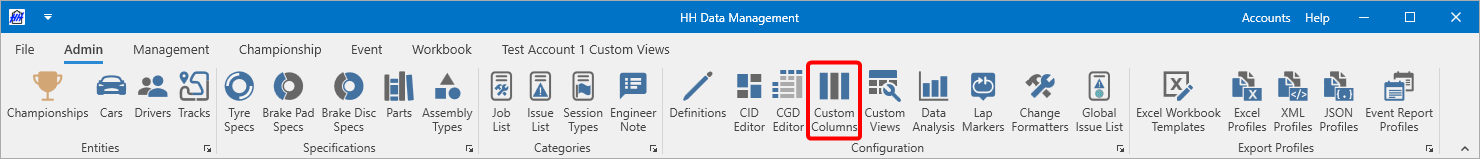
The custom column view can be accessed from the admin tab of the ribbon bar:
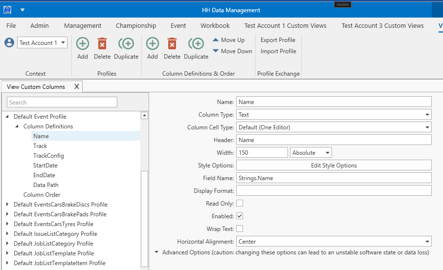
The custom column view will open:
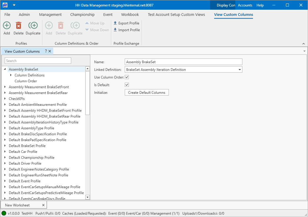
There are three aspects to the custom columns:
Profile
The column profile is the container for the column definitions.

The column profile defines the definition that the column profile is linked to. This is how the column profiles are linked to different parts of the software. For example, a profile linked to the tyre set definition would be used to define the columns shown in the tyre sets view. If there are multiple custom column profiles linked to a specific definition, the Is Default checkbox is used to select which custom column profile will be used in the default views in HH Data Management.
The Use Column Order checkbox can be used to disable the column order feature for the current profile.
The Create Default Columns button automatically generates all default columns for the currently selected profile. Based on the linked definition type, the software provides pre-configured columns. It also creates columns for all Parameters, Part Parameters, Assembly Parameters and Math Parameters. If the profile already contains column definitions, any new columns with names matching existing ones will be skipped. Creating Default columns is only supported up to 100 column definitions. For definitions with many Parameters, it needs to be created manually.
Column Definitions
The column definitions section is where the actual columns are defined.
Using the buttons on the ribbon bar, columns can be added, duplicated and deleted. The columns can be reordered. The order of the columns in the definition is the order they will appear in any view where this column profile is used, unless overridden by the column order feature.
The fundamental setting for the column definition is the column type. All other aspects of the column definition are dependent on this. Each column type is explained below, but first the common settings that will be applicable to all (or most) columns will be presented.
Name
The name of the column definition is only used to display the column in the tree in the custom columns view.
Column Cell Type
The Column Cell Type setting defines how many editors are displayed within one column cell. There are four options available, where the default setting is "Default (One Editor)". Depending on this setting there are more or less parameters that needs to get defined. The Tyres or Tyre Barcodes columns in the tyre-sets view are good examples or where more than one editor within one cell is helpful, because you can arrange the editors more efficiently than in four separate columns.
Header
The header is the text that will appear in the header of the column. By default this has the same value as the name, but can be changed to be anything.
Example:

Width
This determines the width of the column. There are two options for how this can be specified; absolute or relative. Absolute mode, which is the most common, means the value here directly defines the width of the column. In relative mode, the relative widths are used to make the columns fill the entire width of the table. The settings can be mixed, for example all columns could be defined as absolute, and then the last column could be defined as relative, meaning it would fill all available space.
Style Options
Please refer to the style settings documentation for an explanation on how the style options work.
If using a column type like Text where a WPF binding path can be entered, and binding to a readonly property it is important to set the readonly style options to Constant and enabled, otherwise the column will cause the software to crash.
Display Format
This allows the format of the output value to be controlled. For example, as shown in the screenshot the format of a date can be controlled. Please refer to the format strings reference for a full explanation of the options available here.
Read Only
Forces the column to be read only. This will override any settings coming from the permissions. If there is an advanced readonly setting (like an expression or a binding path) defined in the Style Options then the Read Only option is greyed out and you need to change the setting in the Style Options.
If using a column type like Text where a WPF binding path can be entered, and binding to a readonly property it is important to set the readonly style options to Constant and enabled, otherwise the column will cause the software to crash.
Parameter columns
Parameter columns are easy to set up and are designed to work with parameters in the linked definition.
Parameter
Parameter columns are used to link to parameters. The editor shown in the column will depend on the type of parameter selected. If a double or date time parameter is picked then the a display format option will also be available.
| Parameter type | Column type |
|---|---|
| Double | Textbox (only allows numbers) |
| Text | Textbox |
| Boolean | Checkbox |
| DateTime | Date picker |
When using a Parameter column with a column cell type with multiple editors, the parameter types (Double, Text, Boolean, DateTime) for each editor need to be of the same type.
Math Parameter
Math parameter columns are used to link to math parameters. The column will be a readonly column showing the result of the math parameter.
Part Parameter
Part parameter columns are used to link to part parameters. The column will be a combobox column, populated based on the linked part category of the selected part parameter.
Part Item Parameter
Part item parameter columns are used to link to the part item component of part parameters. The column will be a combobox column, populated based on the linked part category of the selected part parameter. All part items from all parts of the linked part category will be shown.
Assembly Parameter
Assembly parameter columns are used to link to assembly parameters. The column will be a combobox column, populated based on the linked assembly type of the selected assembly parameter. All assembly iterations from the linked assembly type will be shown.
Advanced columns
Advanced columns are either designed to work with changes that must be made in a plugin or using resources that are built into HH Data Management. Many columns require setting one or more paths. Those paths will be explained more in detail in the respective section, but there is also a common section about Expression Binding. In legacy mode they require some knowledge of WPF, the user interface framework that HH Data Management is based on.
Action Button
The action button column creates a column with buttons linked to an action property in each row.
- Button Text - The text that is displayed in the button. If Button Text and Button Text Binding Path are defined at the same time, Button Text Binding Path wins.
- Button Text Binding Path - Allows to define the button text dynamically by binding it to a value. The binding path needs to defined relative to the row. If Button Text and Button Text Binding Path are defined at the same time, Button Text Binding Path wins.
- Linked Action - The linked action defines which action will be executed when the button is clicked.
Button
The button column creates a column with buttons in each row.
- Button Text - The text that is displayed in the button. If Button Text and Button Text Binding Path are defined at the same time, Button Text Binding Path wins.
- Button Text Binding Path - Allows to define the button text dynamically by binding it to a value. The binding path needs to defined relative to the row. If Button Text and Button Text Binding Path are defined at the same time, Button Text Binding Path wins.
- Command Name - A binding path to a command that will be invoked when the button is clicked.
- Data Context - The data context changes whether the button binds to a command defined on the overall view model (ViewModel) or on the bound model of each row (Row).
Checkbox
The checkbox column creates a column with checkboxes in each row. The field name is a binding path to a boolean property.
Colour
The colour column creates a column with colour pickers in each row. The field name is a binding path to a string property. The colour column works with HTML formatted colours (e.g. #FFFFFF).
Combobox
The combobox column creates a column with comboboxes in each row. The field name is the binding path where the selected value will be stored. This type depends on the value path that is entered - this field is optional. The items source binding path is a binding path to a collection that stores the items to display in the drop down. The display member path specifies how the displayed items will be formatted. The data context field changes whether the items source binding path binds to a property defined on the overall view model (ViewModel) or on the bound model of each row (Row).
Conditional Math Parameter
The conditional math parameter columns binds to a math parameter (Linked Math Parameter) and a double custom property (Linked Parameter). If the Linked Parameter has a null value, the Linked Math Parameter is shown.
- Linked Math Parameter - A math parameter on the flat model.
- Linked Parameter - If the user enters a value in the textbox, ignore the Linked Math Parameter and instead bind to this.
Data Template
The data template column allows a custom data template to be applied to the cell which allows for custom functionality and appearance to be defined in WPF in a plugin.
Date
The date column creates a column with date pickers in each row. The field name is a binding path to a date time property.
DateTime
The date column creates a column with date time pickers in each row. The field name is a binding path to a date time property.
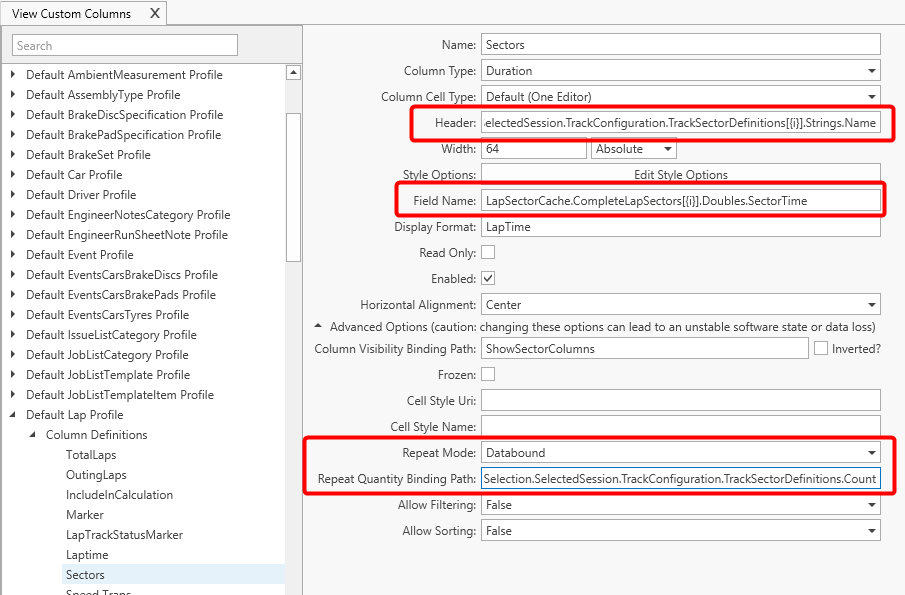
Duration
The duration column creates a column that shows a normal textbox but allows duration specific formatting of the value. The field name is a binding path to a double property. The formatting value could be one of: LapTime, DayTime or DayTimeAllowNegative or a standard time format string.
Enum Combobox
The combobox column creates a column with comboboxes in each row, but unlike the standard combobox columns, the items source isn't a list of items but a .NET enum. The enum type field allows this enum to be defined. The field name is a binding path to a property with the correct enum type.
Multiple Attached File Display
Adds a button, which opens an Attached Files View, which displays files that are attached to this flat model.
- Button Text - The text that is displayed in the button. If there are attached files existing for this flat model, then there will be a small number next to the button text, which shows the user how many attached files there are existing. If Button Text and Button Text Binding Path are defined at the same time, Button Text Binding Path wins.
- Button Text Binding Path - Allows to define the button text dynamically by binding it to a value. The binding path needs to defined relative to the row. If Button Text and Button Text Binding Path are defined at the same time, Button Text Binding Path wins.
- Height - Defines the height of the row. If there are several columns in a row that define the height, then the largest value is taken. If this field is empty the default row height is applied.
- Attached File Parameter Name - This is the name of the attached file parameter from the definition.
- Auto Download Mode - Defines if an added attached file will be automatically downloaded by all users.
- Delete After Upload Mode - Defines if an added attached file will be automatically deleted from the local computer after it is finished uploading.
Single Attached File
Displays a file that is attached to this flat model (or other flat models if the Binding Path parameter is used).
- Height - Defines the height of the row. If there are several columns in a row that define the height, then the largest value is taken. If this field is empty the default row height is applied.
- Binding Path - Path to the underlying flat model. When binding to the current row this field should be empty.
- Attached File Parameter Name - This is the name of the attached file parameter from the definition.
- Auto Download Mode - Defines if an added attached file will be automatically downloaded by all users.
- Delete After Upload Mode - Defines if an added attached file will be automatically deleted from the local computer after it is finished uploading.
Text
The text column creates a column with a textbox that can be bound to numerical or string properties using the field name.
User Selector
The user selector column creates a column with comboboxes in each row that allow a user from the current account to be selected. The user selector column has additional logic compared to a basic combobox column as it filters the users that have been removed from the account. When a user is removed from an account, the date they were removed is recorded and they will not appear in a user selector for any events after that date. If the column is used in a non event based context then all deleted users will be hidden regardless of the date they were deleted.
Advanced options
Column visibility binding path
This allows a WPF binding path to a boolean parameter be specified to control the visibility of the column. A value of true will show the column and false will hide the column, but the inverted checkbox can be use to reverse this behaviour.
Frozen
This allows the column to be frozen when scrolling the table horizontally.
Cell style URI & Cell style name
This lets a WPF style defined in HH Data Management or a plugin be applied to a column. The URI must point to the style definition and the name is the name of the style to be used. An URI has the following pattern: /HHDev.DataManagement.Client.Wpf;component/Components/Styles/RunPlanStyles.xaml
Repeat mode & Repeat quantity binding path
The repeat feature allows a column to be repeated based on two different modes; databound and fixed. In the databound mode, a binding path to a numerical property can be specified. In fixed mode, a constant value can be entered. When this mode is enabled the FieldName and header fields for the column can specify the string {i} in the binding path and this will be substituted with a 0-based counter for each column that is created.
An example of where this feature is used is in the default lap profile to show the lap sectors, where a column is needed for each sector:
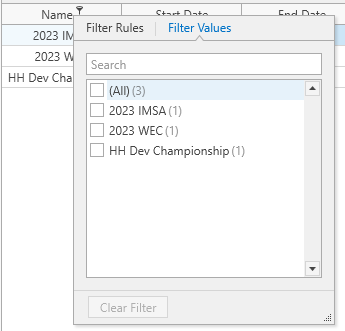
Allow filtering
If filtering is allowed, there are filtering options available in the column headers of the tables:
Allow sorting
Allows to sort a column by clicking on the column header. It's also possible to group rows by a column, by right-clicking the column header. To be able to group by column, this columns needs to allow sorting.
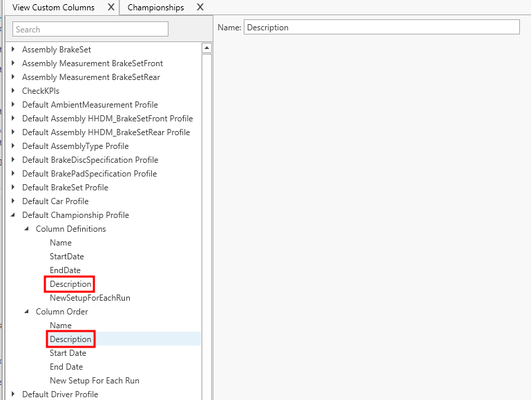
Column order
The column order feature allows the order of the order of the columns to be customized. This is only really useful if a plugin is used to add customized columns. Sometimes columns may be needed with logic that cannot be supported by the options available in the custom columns. In this case the columns can be defined in a plugin which gives more flexibility. In this case the plugin columns are always placed after the columns defined in the software, but this might not be the desired behaviour.
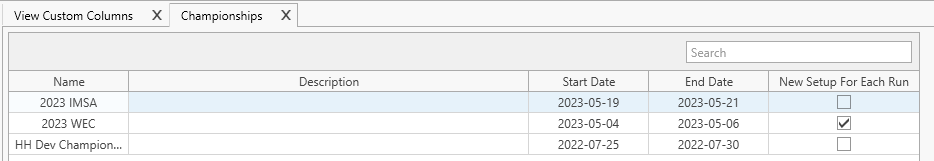
To use the column order feature, select the Column Order node in the tree and use the buttons on the ribbon bar to create new items. Set the name of each column order item to the header text of the column definition (or the plugin column). Then set the order of these items to the desired order. This will now override the order of the columns in the column definition. In the following example, the position of the Description column has been overridden by the column order feature.